MSEI Renamic Neo - Component Library
A component library that contains UI elements for the Renamic project.
⏱ Duration: 5 months (internship)
👩💻 Role: UI/UX Design Intern

Micro Systems Engineering, Inc. (MSEI) provides cardiac rhythm management and technologies that help the human heartbeat optimally. They produce implantable medical devices which include pacemakers, defibrillators with leads, and remote monitoring opportunities for patients.
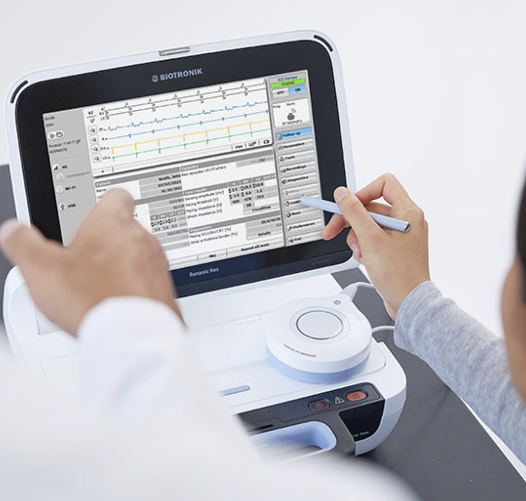
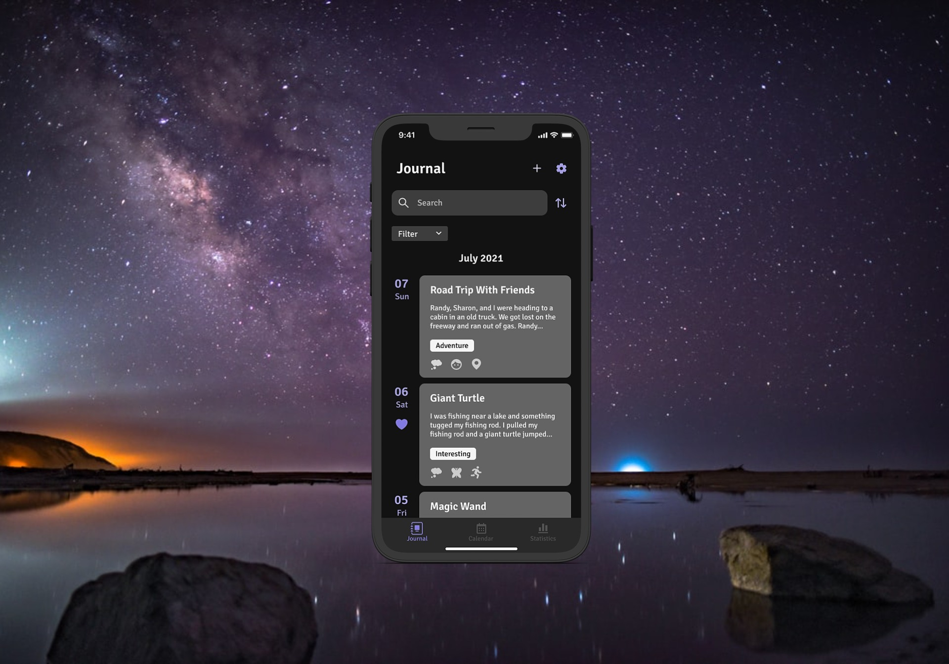
Renamic is the programmer that helps healthcare workers manage the patients’ pacemakers or other implantable cardiac devices. The image on the left shows the current design for Renamic programmer.
Challenges
My team’s project was to recreate a user-friendly design for the Renamic. When I joined the team, the team was in the process of migrating from their old design tool (Sketch) to a new one (Figma). However, once their screens were transferred, they lost their ability easily create and edit screens.
Solution
Improve the efficiency and convenience of creating and editing screens.
Create a component library that contains all of the project’s UI elements (buttons, icons, etc.). Team members will be able to drag and drop elements and make universal changes quickly.
Design Goals
Create a component library
Build a component library that is easy for teammates to understand and use
Recreate existing screens to take advantage of the component library’s benefits
Note: Due to the company’s privacy policies, some components are not from their library.

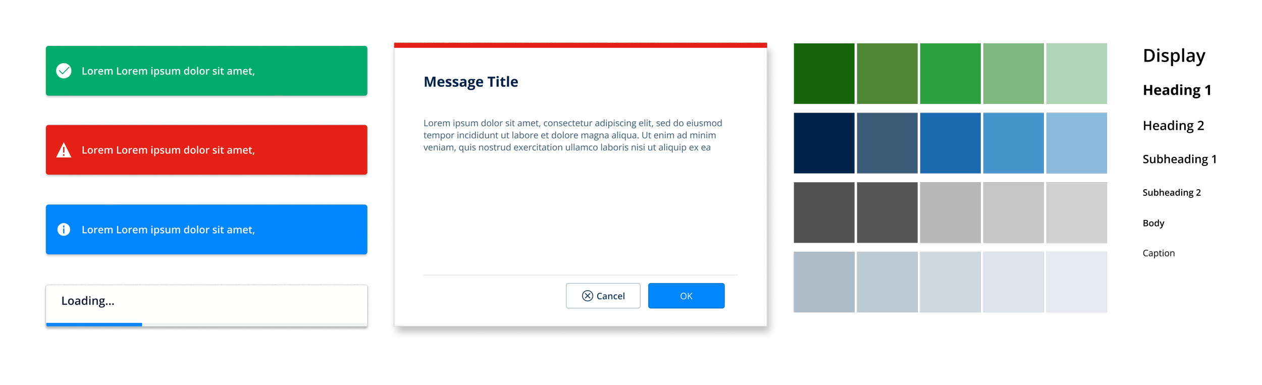
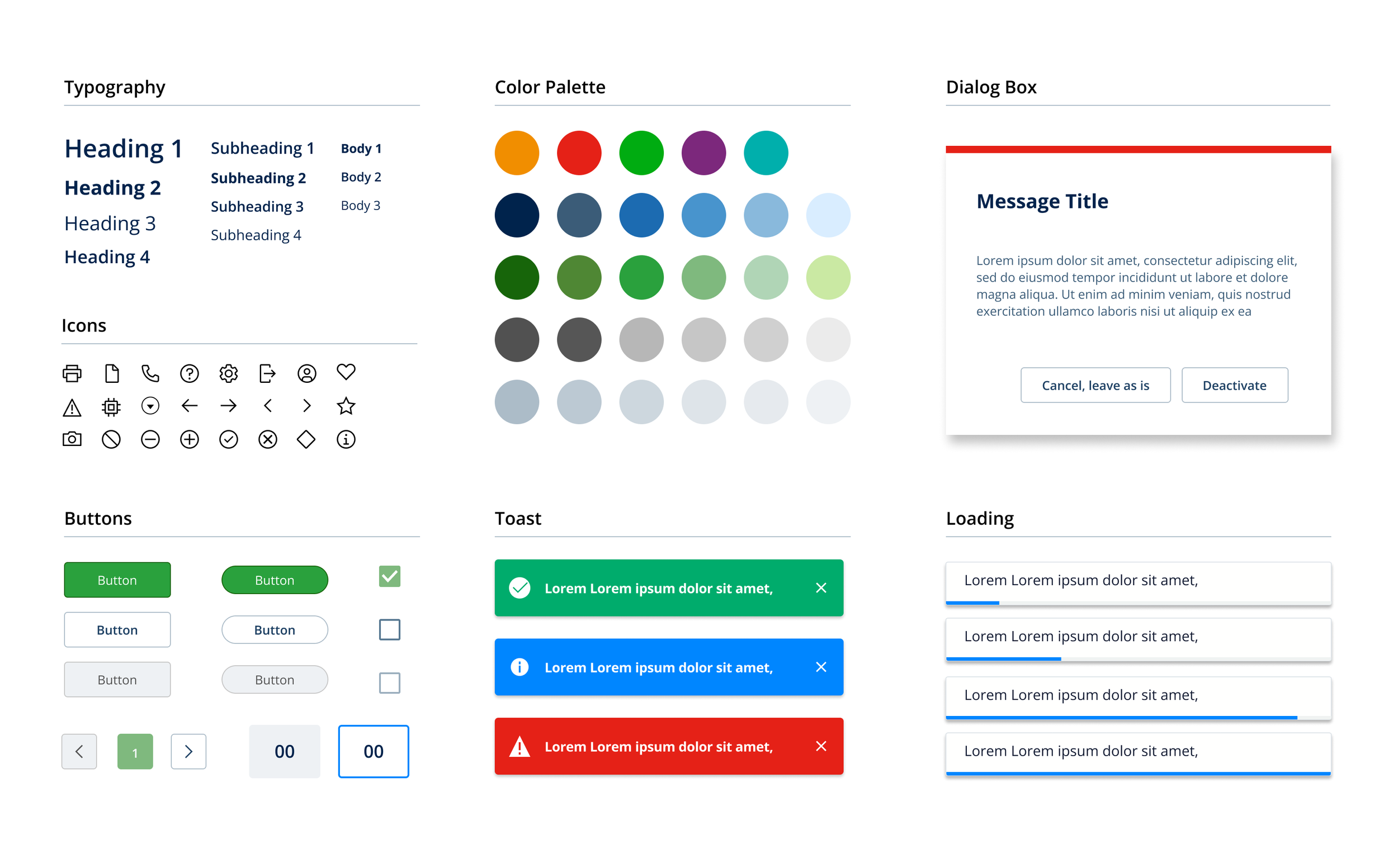
Component Library
What is a component library?
A collection of reusable functional elements and components.
Clear standards that the product team uses to create a consistent experience across a range of products.
Why is it important?
No longer need to constantly refer back to the style guide.
Ensure all elements are consistent
Make the layout simpler, and quicker
Better efficiency when editing or creating new screens.
Components play an important role in increasing efficiency.
Let's say I have 200 screens for my project and I want to change the button's color. Having to update each individual button would be a nightmare. Components, on the other hand, allow me to make universal changes with a single modification.

Building Components
The First Method
When I first saw someone using component libraries, I was intrigued. So I started looking for lessons on YouTube. I have seen this method in many component libraries. I used variant properties to switch between different buttons. The following is an example of how I previously created a set of buttons for a component library.
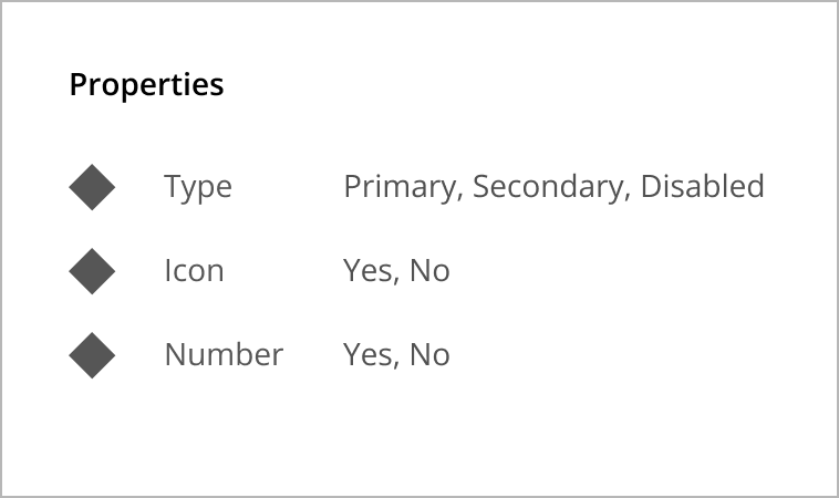
Component settings
Variant property abilities
Change the type of button
Icon Visibility
Number Visibility
Demo
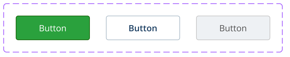
Here is an example of how I would replicate a button using just variant properties. As you can see, I had to click the icon, number, and label in order to make changes to them.
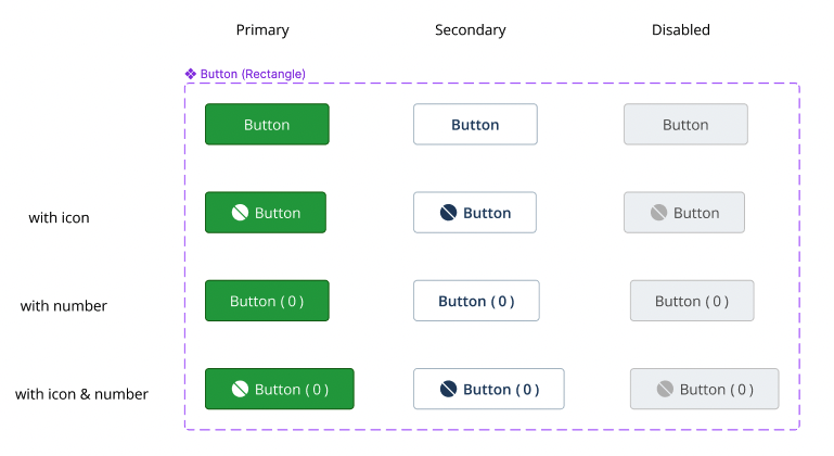
The buttons in the component library consist of 3 button types (primary, secondary, and disabled), icons, and numbers.

The Second Method
The more I studied Figma, the more features I found that made it easier to use components. Instead of using variant properties alone, I use instance swap properties, booleans, and text properties.
This is my new button component setup for the same button. Previously, there were 12 total buttons. This simplified method only requires 3 buttons. Also, I made a list of all the possible buttons on the page, but not as components, so that everyone could see them.
Component settings
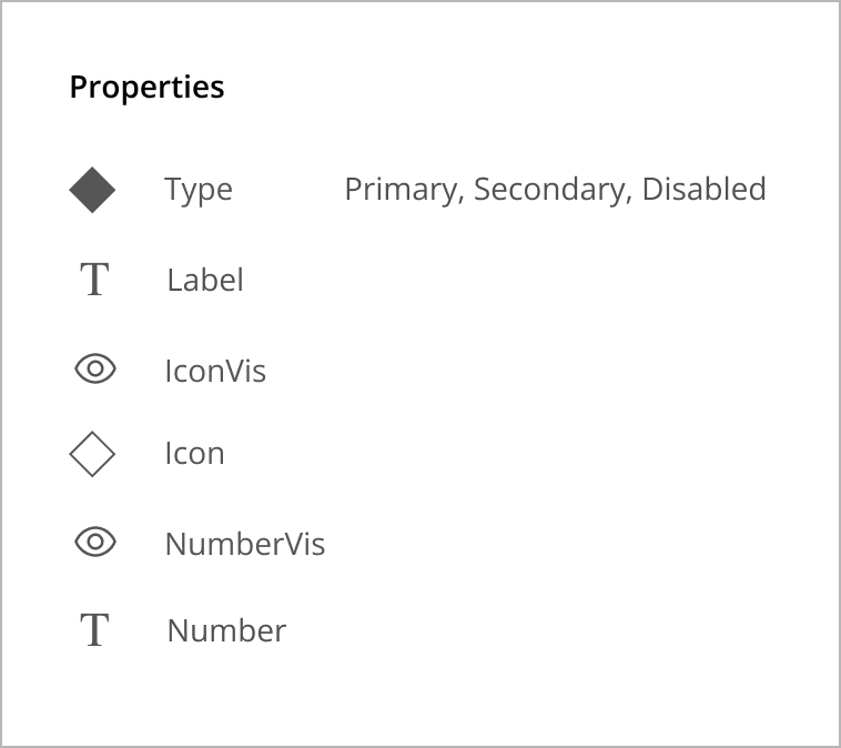
Property abilities
Type of button
The label on the button
Icon visibility
- Type of iconNumber Visibility
- Number
Demo
Here is how I would replicate the same button using the new properties and features I learned. I can make changes directly from the right sidebar, so I don't have to click on any icons, labels, or numbers.

Styles
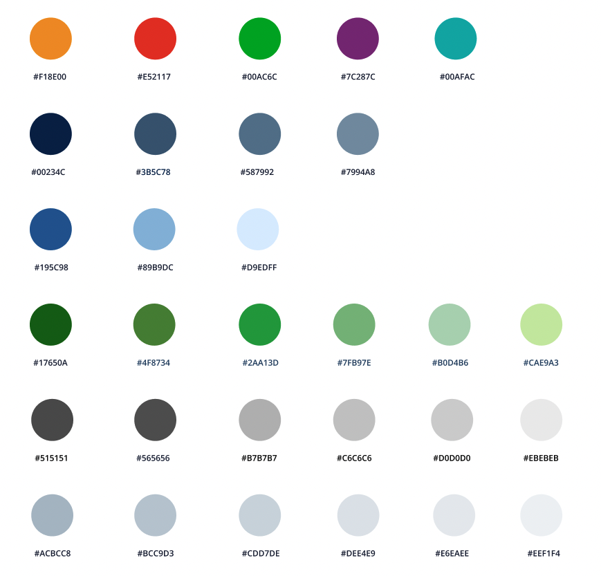
Color Styles
Similar colors can be found in color palettes, making it hard to keep track of them. Continually referring to the style guide will not be efficient too. Using the Styles tool, I can save all of the colors from my color palette. They can be categorized and labeled in any way I like. In the demo below, you can see how convenient and quick it is to switch between colors.
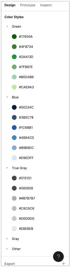
Demo
Here is the color style feature in action.

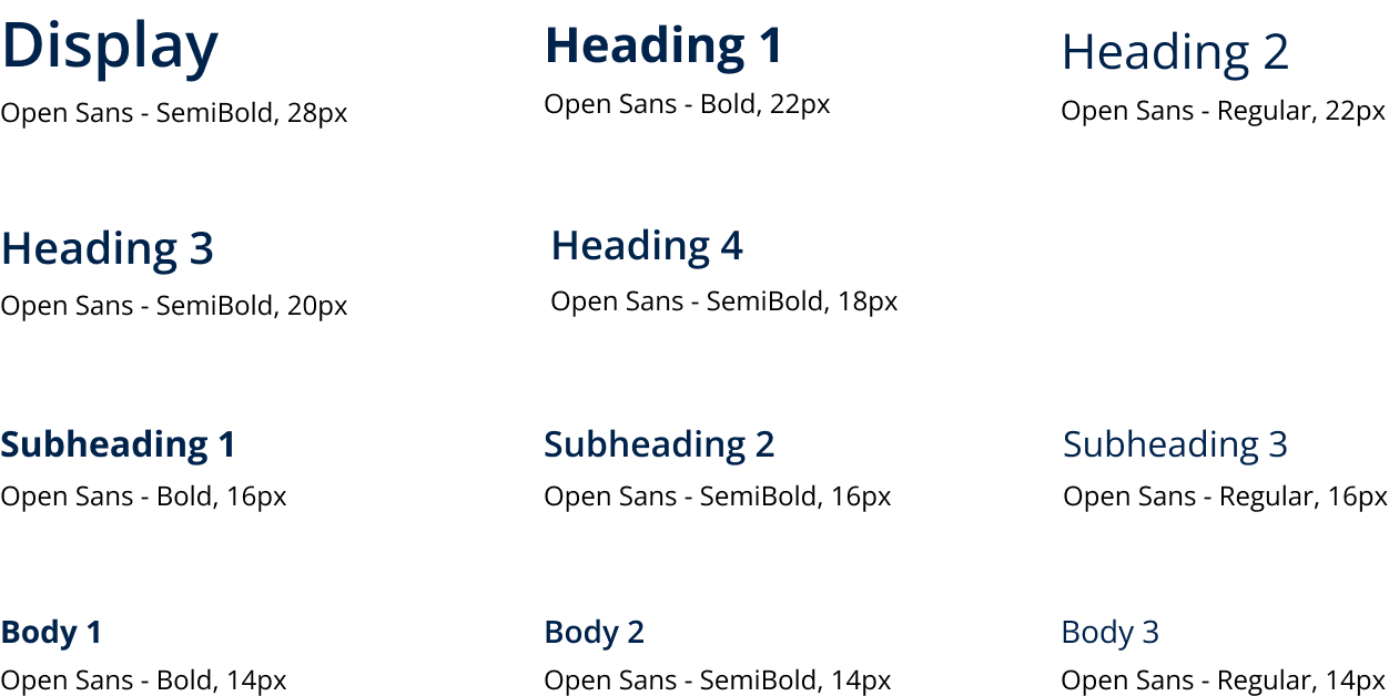
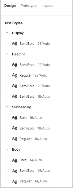
Text Styles
As with colors, maintaining track of different text styles can be challenging. Thus, I took advantage of the text styles feature in Figma too.
Demo
Here is the text style feature in action.

Components
Here are some components that I have created. Click or tap play to view how each component works!
Button & Button Bar
Tile
Dialog Box
Toast
Progress Bar
Sidebar

Conclusion

The screens for the project were transferred from the team’s old design tool (Sketch), which lost the ability to easily edit and create new screens in Figma. I took the initiative to create a component library to increase efficiency, consistency, and organization.
Once I had created the component library, I proceeded to recreate the existing screens using the components. Any modification to the main component will affect its copy. In other words, if I wanted to change the color of a button, I would only have to change the color of the main component. Imagine having 200 buttons and having to replace each one individually.
My team found it easy to use Figma's features like components, instances, variants, styles, etc. The team could now easily make small or large edits in the blink of an eye. It is exciting to see how my contribution will impact the team as well as future designers. Figma has many cool features that I would like to explore, and I'd like to apply that knowledge to improve projects for future companies.
Other Case Studies
End-to-End Mobile App
Dream Portal
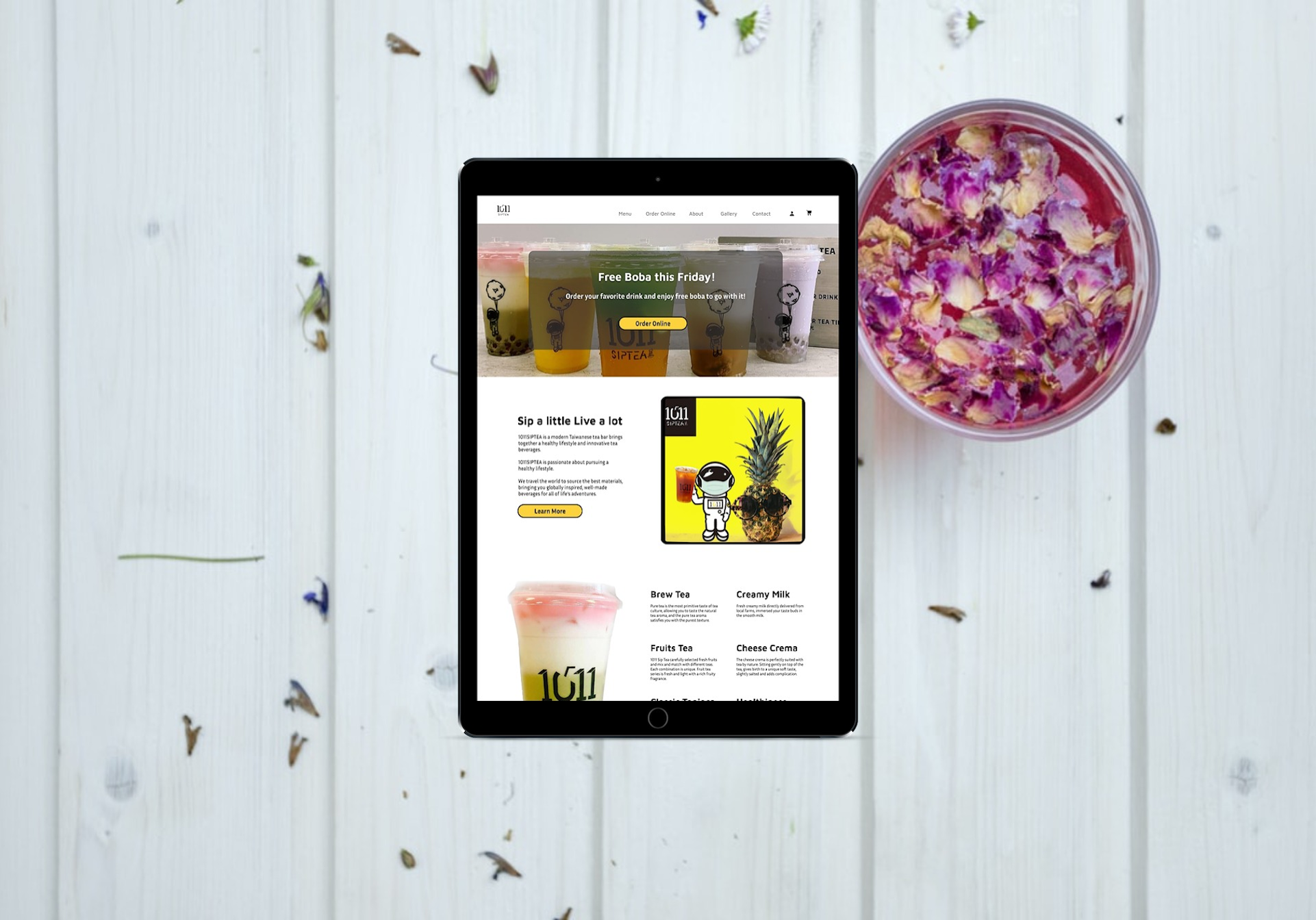
1011 Sip Tea
Responsive Website Design
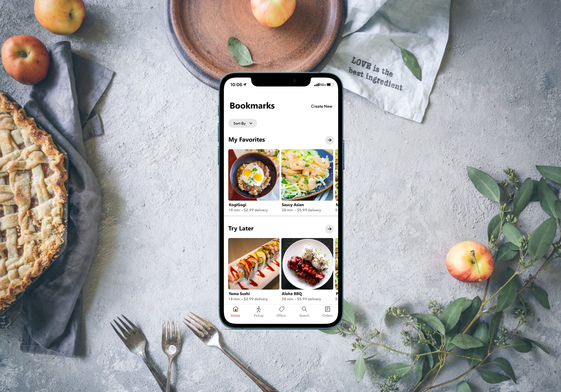
DoorDash
Feature Within Existing Product