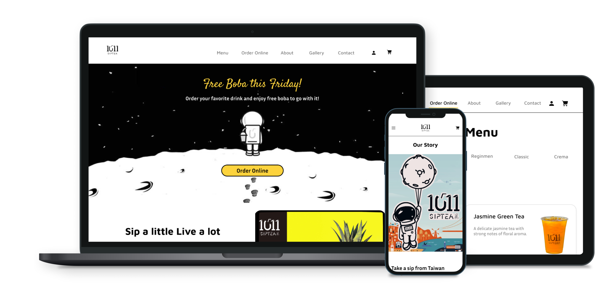
1011 Sip Tea - Responsive Design
Providing customers with the option of ordering drinks online.
⏱ Duration: 1 month
👩💻 Role: Product Designer

1011 Sip Tea, which was founded in Taiwan, is now a tea bar in San Francisco, California. 1011 Sip Tea combines a modern lifestyle, healthy living, and tea culture. “SIP a little LIVE a lot!” is their slogan. The company's mission is to allow customers to relax with a cup of boba or bubble tea no matter how busy their schedule is.
Challenges
The boba industry in San Francisco is highly competitive because the city has one of the most boba shops in California. For this reason, 1011 Sip Tea struggles to find customers. 1011 Sip Tea currently does not have a website, which makes it difficult for them to promote their business online.
Solution
Increase sales and noticeability
Create a website design that showcases the shop’s fresh and unique branding. In addition, create an online ordering feature on the site to increase sales.
Design Goals
Design a responsive website for desktop, tablet, and mobile.
Create a new menu page that contains photos.
Design a checkout process.
Create a website that aligns with the brand’s trendy aesthetics.
Design Process

Discover
Research Goals
Determine any difficulties users may encounter when purchasing boba online.
Discover features that customers find helpful.
Learn users’ thought process when buying boba online.

Competitive Analysis
I wanted to conduct a competitive analysis to discover the methods competitors use to drive their sales. It can also help me identify any trends to make sure I am meeting and exceeding standards.
Direct Competitors
Indirect Competitors
Findings
Ability to contact the restaurant about inquiries is important.
Customers should be able to find contact information easily.
Hours and locations listed.
Drink descriptions and photos are important so customers know what they are buying.
The ability to adjust sweetness gives users more control of their drinks.
Separated categories make it easier for customers to browse for drinks.
Delivery fee and delivery time must be available.
Customers should have control of payment options and pickup options.
Quicker transactions when customers know what product options are required.
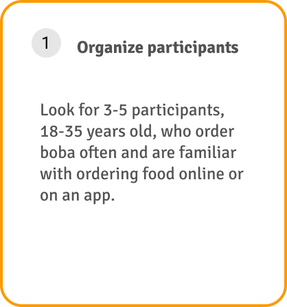
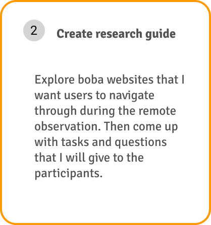
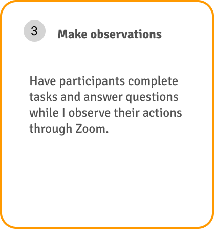
User Interview
In order to better understand the way users navigate different boba websites, I performed a remote observation.
From the remote observation, I was able to come up with a list of frustrations and improvements.
Frustration
The menu had no images or is disorganized
Distracting colors made text illegible
Users are required to make an account to make an order
Improvements
Labels on links should be clear and straightforward
Divide drinks into categories and add images to the menu
Ensure colors are easy on the eyes and maintain the brand’s theme

Persona
In my conversations with participants, I learned that most customers order pickups online out of convenience. The flexibility of scheduling the pickup time and the ability to order drinks ahead of time appeals to them. Drinks are displayed in photos, categories, and descriptions to help customers choose a drink. Additionally, some customers noted that they enjoy taking their time choosing their drinks. Sydney is a user persona who embodies the needs, frustrations, and goals.


Identify
Feature Roadmap
I organized the priorities by P1 (must have) - P4 (can come later). For example, the menu is needed for users to view the shop’s drinks. On the flip side, signing up for email notifications is not required to complete a purchase.

Sitemap
To help me understand how to structure the website, I created a sitemap. The ordering ahead category in the navigation bar has the most pages since the other categories only display the shop's menu and branding.

Design
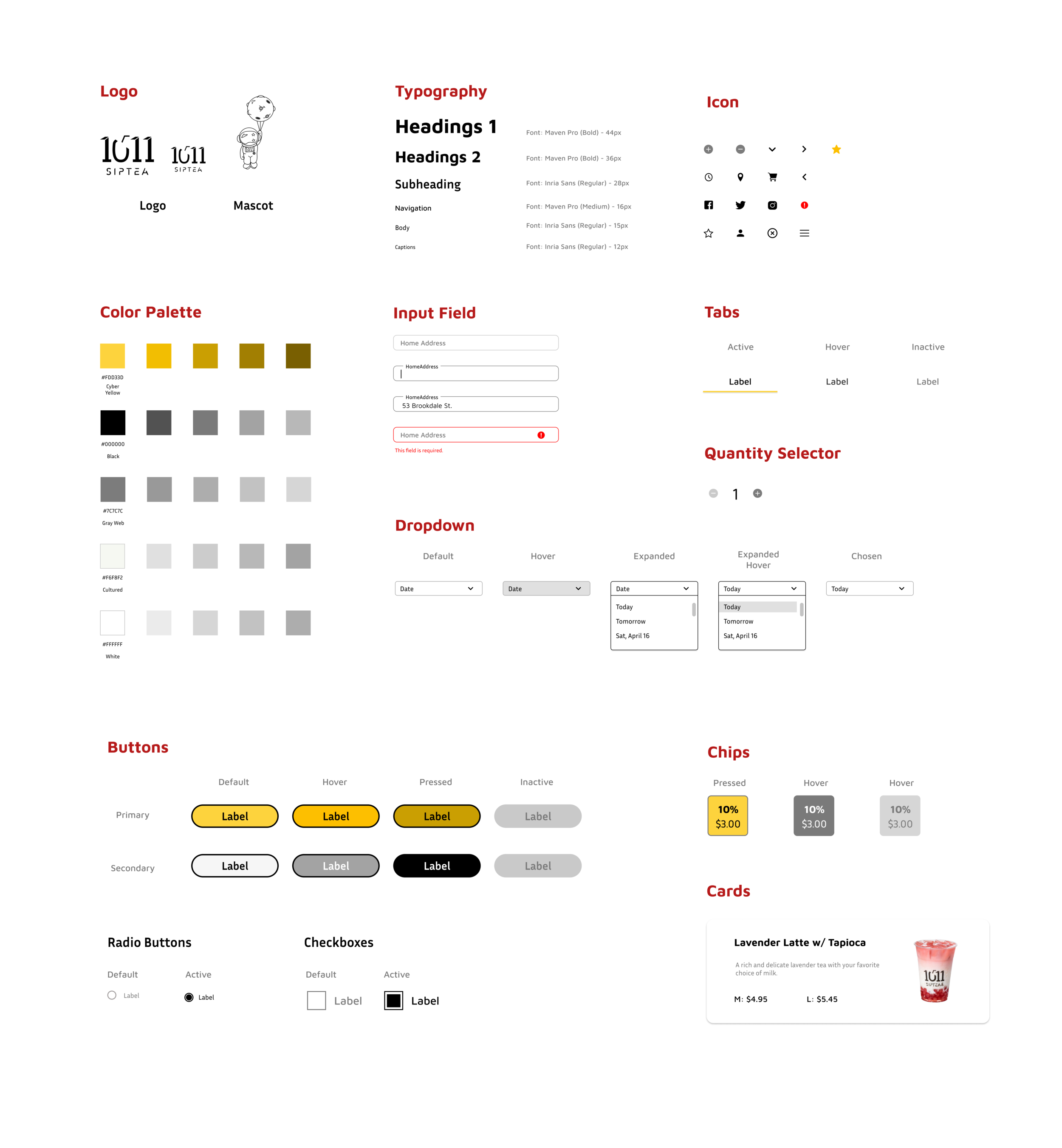
UI Kit
Their branding adjectives are tasty, casual, modern, and futuristic. I started with a UI Kit to create components that I can use moving forward. I want to maintain consistency throughout the website and that all UI elements are cohesive and aligned with 1011 Sip Tea’s brand. The color palette relates to the shop’s astronaut mascot and futuristic tone. I chose Maven Pro (sans-serif typeface) because of its unique curvature, flowing rhythm, and modern design. View the UI Kit in detail by clicking on the image below.

Low Fidelity Wireframes
I created the pages based on the research and brand design.
Below are a few of the low-fidelity wireframes for the desktop. Feel free to click or tap on the button to view my wireframes in detail.
Insight #1
In the Discover stage, I learned that users appreciate drink photos and descriptions because it helps them decide what to purchase. With that in mind, I created a menu page that contained those features.
Insight #3
Users also enjoyed reading reviews and customer quotes, so I included that on the homepage.
Insight #2
Users stressed the importance of flexibility, especially in scheduling pickup time. Thus, I created a checkout page that enables those abilities.
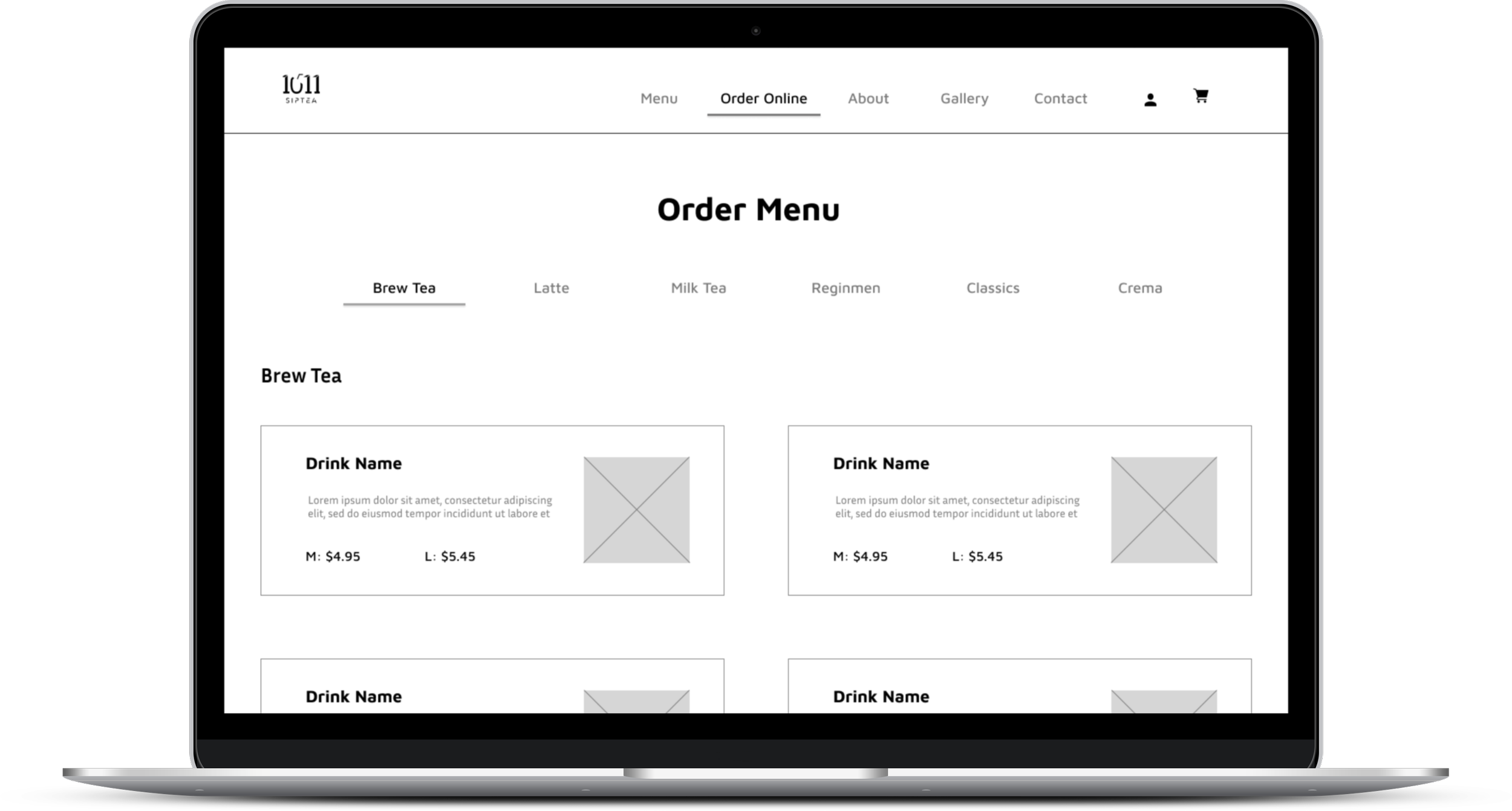
High Fidelity Wireframes
After defining the information architecture and UI components, I filled in the graphic details missing in my low fidelity wireframes to visually represent the end product. I would then build a prototype to validate complex interactions during usability testing to determine if the design aligned with users’ mental models and solved the problem identified in the Define phase.
Click or tap on the button below to view the rest of the wireframes.

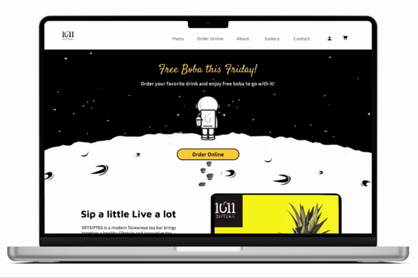
Initial Desktop Prototype
I am ready to create my prototype after completing my information architecture, UI elements, and wireframes. I created copies of similar pages, incorporated interactive states into each page, and then wired each state to its corresponding page. I can conduct a usability test on the prototype and observe the site's functionality. This prototype will order a Lavender Latte ( large, no sweet, regular ice, no toppings) for pickup at 4:40 pm. Users can filter drinks by categories on the menu, giving them another way to browse.

Verify
Usability Testing
Goals and Objectives
Understand the user’s thought processes and what actions they take when purchasing a drink online.
Discover any issues and struggles users experience.
Test the effectiveness of CTA in guiding the user to complete the task.
Determine if users use filters while browsing for drinks.
Methodologies
Remote Observation - Participants will share their computer screen while I observe their actions through Zoom.
Scenario
You want to get a boba before work on a hot day. Since 1011 Sip Tea is close to work, you decided to order pickup there. The Lavender Latte on their menu catches your eye.
Task
Order a large Lavender Latte with no sugar, regular ice, and no toppings. Pick up today at 4:40pm.
Finding #1
Half of the participants clicked the "Order Online" button on the hero image, while others used the navigation bar.
Finding #2
Most participants clicked on the "Latte" category on the order menu page so that latte drinks appeared first.
Finding #3
Participants browsed for drinks by viewing photos on the menu.
Finding #4
The drink's red color deceived some of the participants. Participants assumed the Lavender Latte would have lavender or purple color.
Finding #5
The participants all agreed that indicating "required" and "optional" indications on drink options were useful.
Finding #6
Each participant said that the CTA buttons guided them throughout the checkout process.

Affinity Map
In the usability test, the participants commended the photos, filters, and scheduling flexibility. They provided great feedback and pointed out the information I missed on my website. By keeping that in mind, I was able to identify improvements that could be made to my prototype.
Top Concerns for Users
Not knowing where the homepage reviews were from
Some buttons were placed in an odd location
Not knowing which drinks were popular
Unable to find a specific drink due to the drink’s color
Missing topping prices
Opportunities
Specify that the reviews are from Yelp.
Indicate popular drinks on the menu.
Sort menu items alphabetically so that users can easily find the drink.
Add the pricing for each topping
"Review Order" and "Place Order" buttons should be below the order total.
Iterated Prototype
Based on the opportunities I discovered from the Affinity Map, I made some iterations to the prototype.
I changed “Reviews” to “Yelp Reviews” to specify where the reviews are from.
As suggested, I added the price for each topping
Users were having trouble finding Lavender Latte because the drink color is red. I alphabetized the menu so that users can easily find a specific drink. I also indicated popular drinks on the menu.
The “Review Order” button was originally at the bottom of the page. Now it is on the order summary, which forces the user to review the order summary before moving on.
Check it Out!

Conclusion
This project gave me insight into how to identify a company’s branding and design features that make ordering products more convenient.
Lesson Learned
It blew my mind that a simple thing, like color, can affect customers' perceptions of a drink. I chose a drink with a unique color for my research. As a result, some users had more trouble finding the right drink than completing the checkout process. Next time I will be more aware of simple things that might affect my research in the future.
Next Steps
I will measure the extent of my impact by using before-after comparison data. With that information, I will make more iterations to improve the website's usability.
Other Case Studies

Dream Portal
A tool that keeps track of people's dreams and unconscious minds.
LepsiCare
Where can I keep all of my seizure information in one place?
Design Projects
Volunteer services and designs for social media