Dream Portal - End-to-End Design
A tool that keeps track of people's dreams and unconscious minds.

⏱ Duration: 1 month
👩💻 Role: Product Designer

Enter the Dream Portal to access your personal journal for your adventurous dreams and stories. This app allows users to record their dream content and collect data such as common dream types. By recording dreams and journaling them, we can discover new things, become more creative, and gain insights into our subconscious.
Challenges
Many experts say dreams exist to help solve problems, incorporate memories, and process emotions. However, when we want to remember our dreams, we only have a vague recollection in the morning. Recording dreams takes some commitment, but we may pick up meaningful information about our daily life (stress, conflicts, etc.)
Solution
Increase the user’s awareness of their dreams.
My solution is to create an app to help users quickly record, organize, and analyze their dreams.
Design Goals
Design an end-to-end application that acts as a dream journal to help users record and analyze their dreams.
Design Dream Portal’s brand
Design mobile version first since mobile is more accessible for users to access the app when they wake up immediately.
Design Process

Discover
Research Goals
Discover different ways of recording information.
Understand user preferences when it comes to documenting.
Find what motivates users to continue logging in information to an app.
Find any frustrations users experience when recording info.
Analyze competitor’s UI patterns for journalizing.
Discover any components from competitors’ apps that provide a positive user experience when recording.

Heuristic Analysis
I analyzed the usability of two dream journal apps and two general journaling apps. The analysis allowed me to discover patterns or features that may prevent users from using the apps.
Too much content information on one page
Everything must be completed in order to add an entry
Too many choices to choose from
No search option
Unable to create a new theme
Barely any white space, which may confuse users
Color meaning is not clear
Surveys
Survey Goals
Discover different ways of recording information.
Understand user preferences when it comes to documenting.
Find what motivates users to continue logging in information to an app.
Find any frustrations users experience when recording info.
Insight #1
People enjoy using apps to record their notes. They easily recall their notes by reading text, viewing images, and listening to audio recordings.
Insight #2
Issues people experience include finding old notes and reading vague notes that are hard to remember.
Insight #3
People say typing notes and using voice-to-text is the quickest way to record their notes.
Insight #4
The reason people stop using apps to record notes is that they cannot remember to record them, they find no purpose to do so, or they feel the app is not engaging.

Identify

Sitemap
Now that I understand the issues, preferences, and methods of recording information, I can create a sitemap. Creating a sitemap helped me understand how I can structure the app. I started building the sitemap with the three sections I wanted on the tab bar (Journal, Calendar, and Statistics).
UI Requirement Document
By creating a UI Requirement Document, I can write down all the features I need for my design. I wanted to include a Journal page, Calendar page, Stats page, reminders, and a passcode lock. Here are the specific components for each feature.
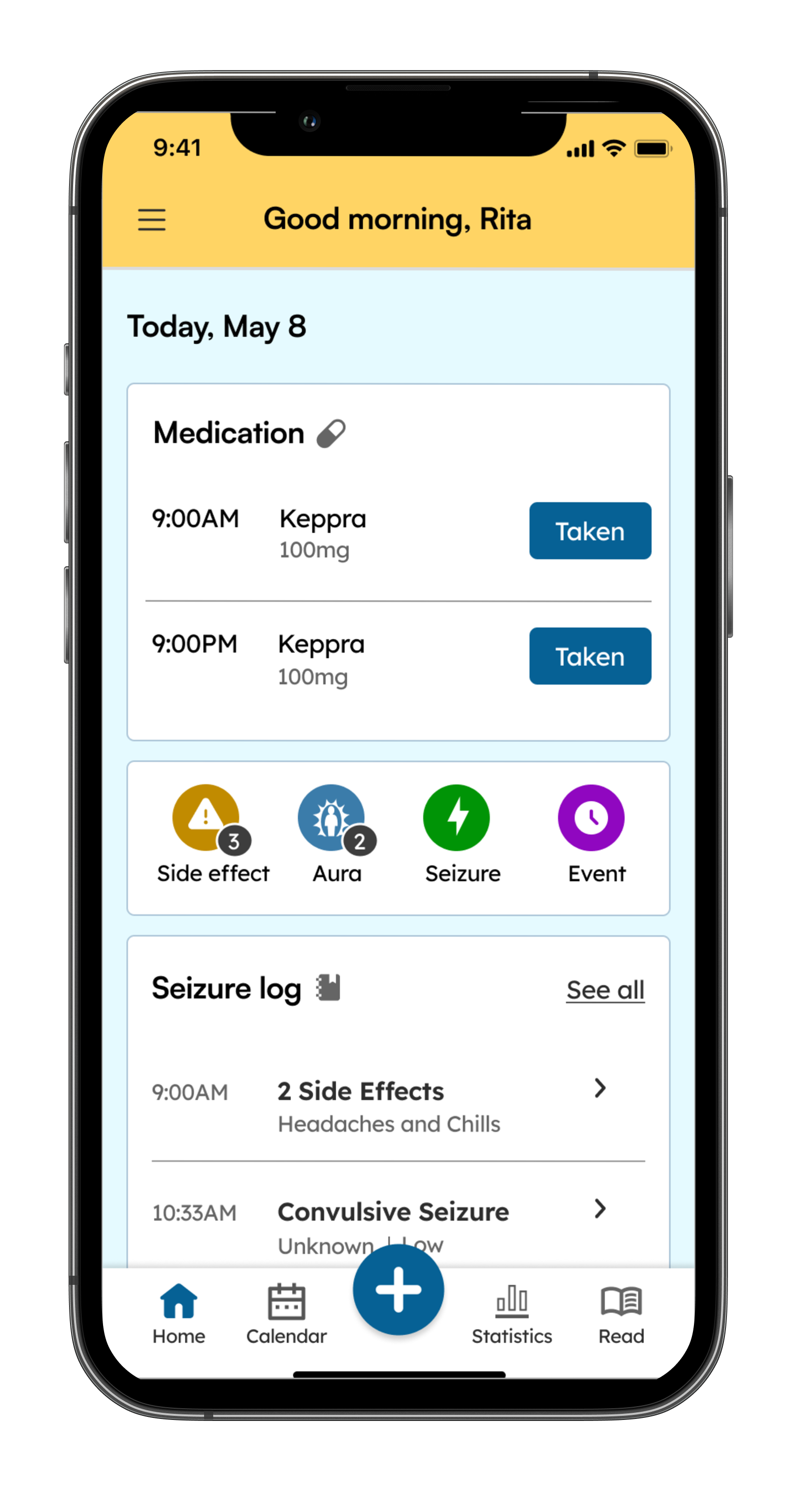
Header
Title: “Journal”
Settings icon
“+” icon that users tap to add an entry
Search icon
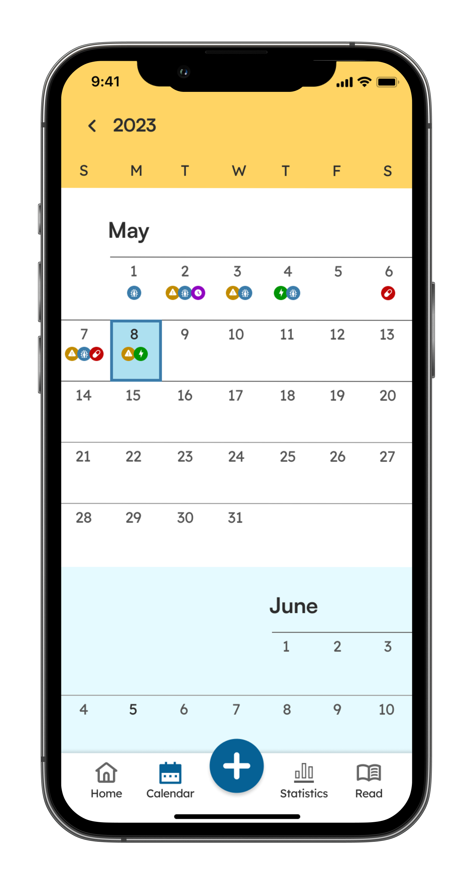
Header
Title: “Calendar”
“+” icon so users can add an entry on a specific day
Current date indication (different color)
Dream indication (different color or dot below the date)
Some kind of navigation between previous/future months
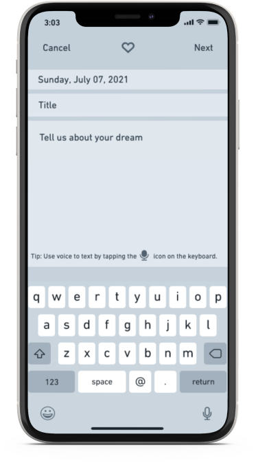
Adding journal entry
Typing and voice-to-text abilities
Heart icon to add dream to favorites
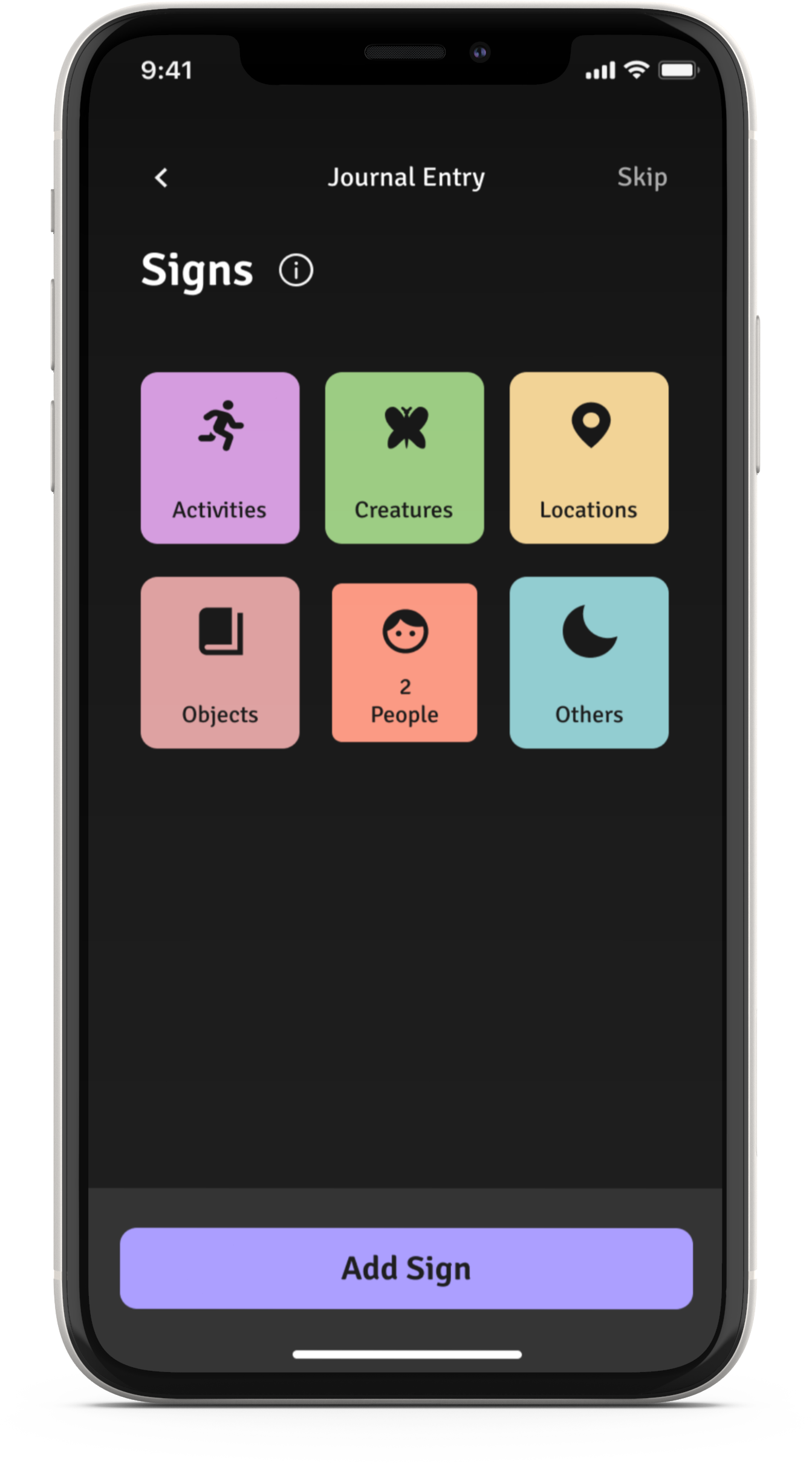
Additions to their entry (dream type, category, sign)
Button to go back and skip
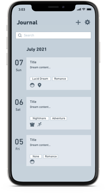
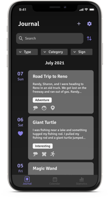
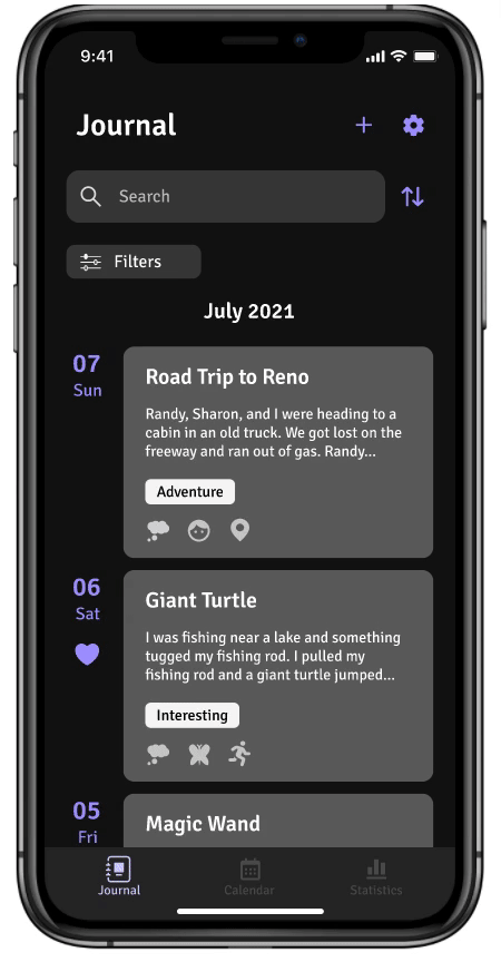
List of journal entries
Filters (types of dreams, category, signs)
Each entry contains
Entry title
Preview of a journal entry
Date
Dream Type
Small icons that represent dream categories
Journal Entries
Calendar
Header
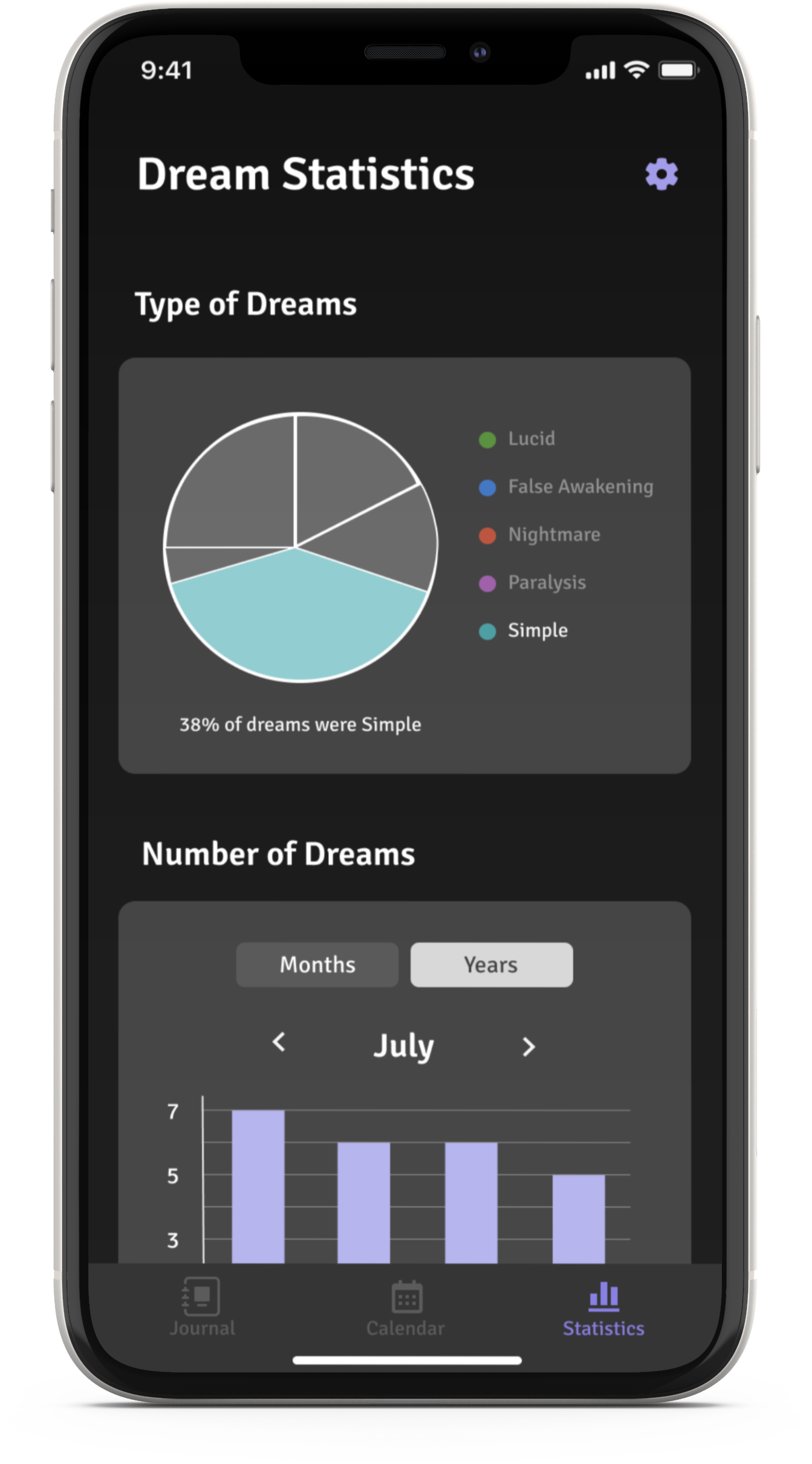
Title: Dream Statistics
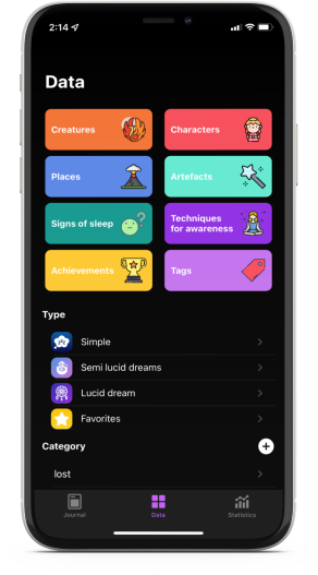
Dream types (color-coded)
Pie chart
Total number of dreams
bar graph
Dream categories
bar graph
Signs (color-coded)
Number of times the sign appeared in dreams
Statistics Page
Number keypad for the user to input their passcode
Option for users to turn the lock on/off
Option for users to change their passcode
Face ID option
Passcode Lock
Heading
Title: “Reminders”
Boxes for the user to set time and date
Submit button to save information
Option for user to turn reminder on/off
Reminders

Design

Mood board
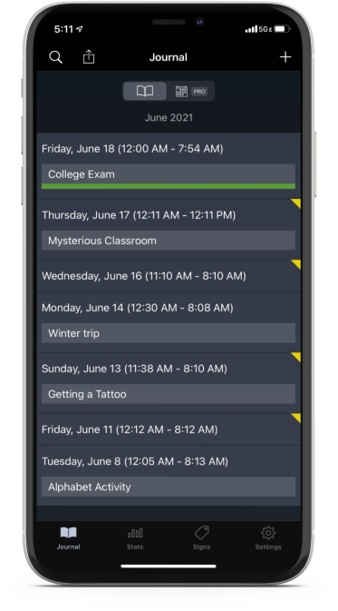
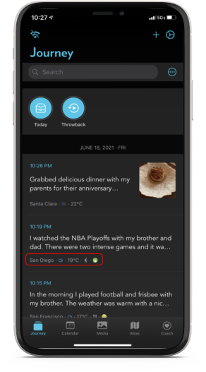
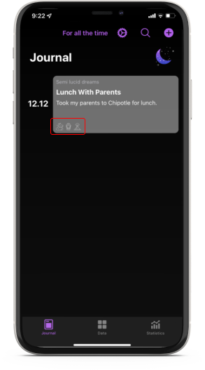
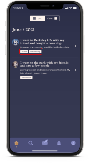
I took the same four journaling apps from my heuristic analysis. Unlike the heuristic analysis, I can easily compare the apps’ pages by putting their screens next to one another. The mood board was also an opportunity for me to gather ideas for my reminders and passcode lock screens.
Symbols and Dream Details
These apps feature symbols that show the dream details so the user can preview them.
Statistics Page
I was inspired by the colors, visuals, and interactions on the statistics page.


Brand Design
Brand Name
I came up with a couple of possible brand names for my dream journal.
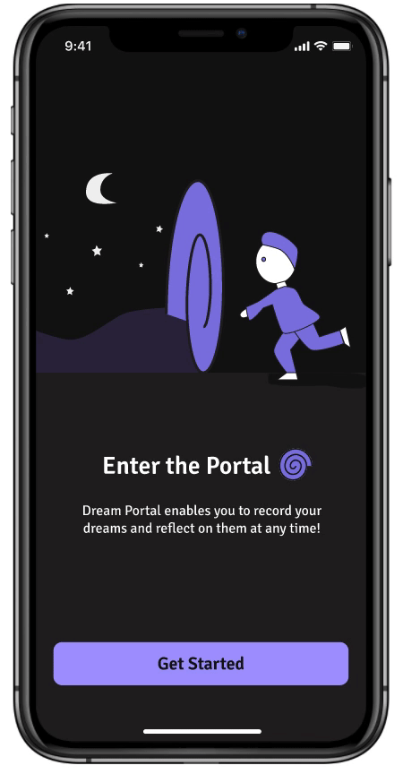
1. Dream Portal - a gateway between reality and subconscious
2. Dream Mode - similar to Dark Mode
3. Dream Mirror - reflecting your inner self
I named the app “Dream Portal” for a couple of reasons. A portal can be a gateway between two worlds (reality and dreams). The “portal” allows users to enter their “dream world” at any time of the day. I also thought an app that acts as a portal would be a fun concept.
After sketching my ideas on paper, I thought #3, #4, and #5 designs were excellent. Design #1 could be interpreted as leaving the portal, and I thought design #2 did not seem bold enough to stand out. I decided to digitalize Design #3-5 and compare them on a black background (dark mode).
Design #3
Design #4
Design #5
Once I put these designs side by side with color, I chose Design #5 as my logo for several reasons. Design #3 is resizable and straightforward, but looks less like a portal than Design #4 and #5. It was cool how Design #4 felt like I was being sucked into a portal. However, the design will be difficult to resize and may look too complicated on mobile. Design #5 seemed perfect because it is bold, simple, resizable, fun, and clearly shows a portal.
Brand Logo
Since the app is called “Dream Portal,” it only made sense that I considered the logo to look like a portal. Since dreams happen during the night, I thought I could add something that represents the night. I came up with a couple of ideas and sketched them out.

Low-Fidelity Wireframe
From the mood board, I wanted to incorporate the dream details previews on the Journal Page. The survey indicated that participants used voice-to-text to quickly record information. Thus, I noted the voice-to-text instructions on the dream content page.
High-Fidelity Wireframes
The high-fidelity wireframes will visually represent the end product. Afterward, I can build a prototype to validate interactions during usability testing to see if the design aligns with users’ mental models and solves the identified problem in the Define phase.
Click or tap on the button below to view the rest of the high-fidelity wireframes.
“+” adds a new entry
Dream details symbols
Favorites feature
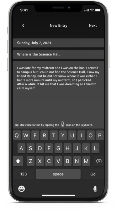
Voice to text instructions located above the keyboard
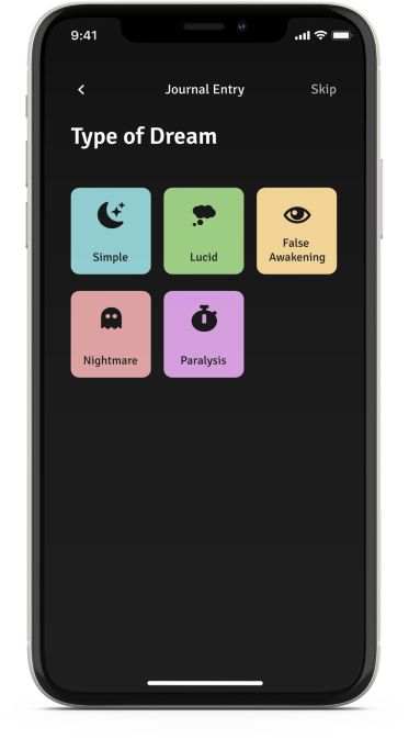
Each icon represents a specific dream detail. It appears on the homepage so users can recognize it.

UI Kit
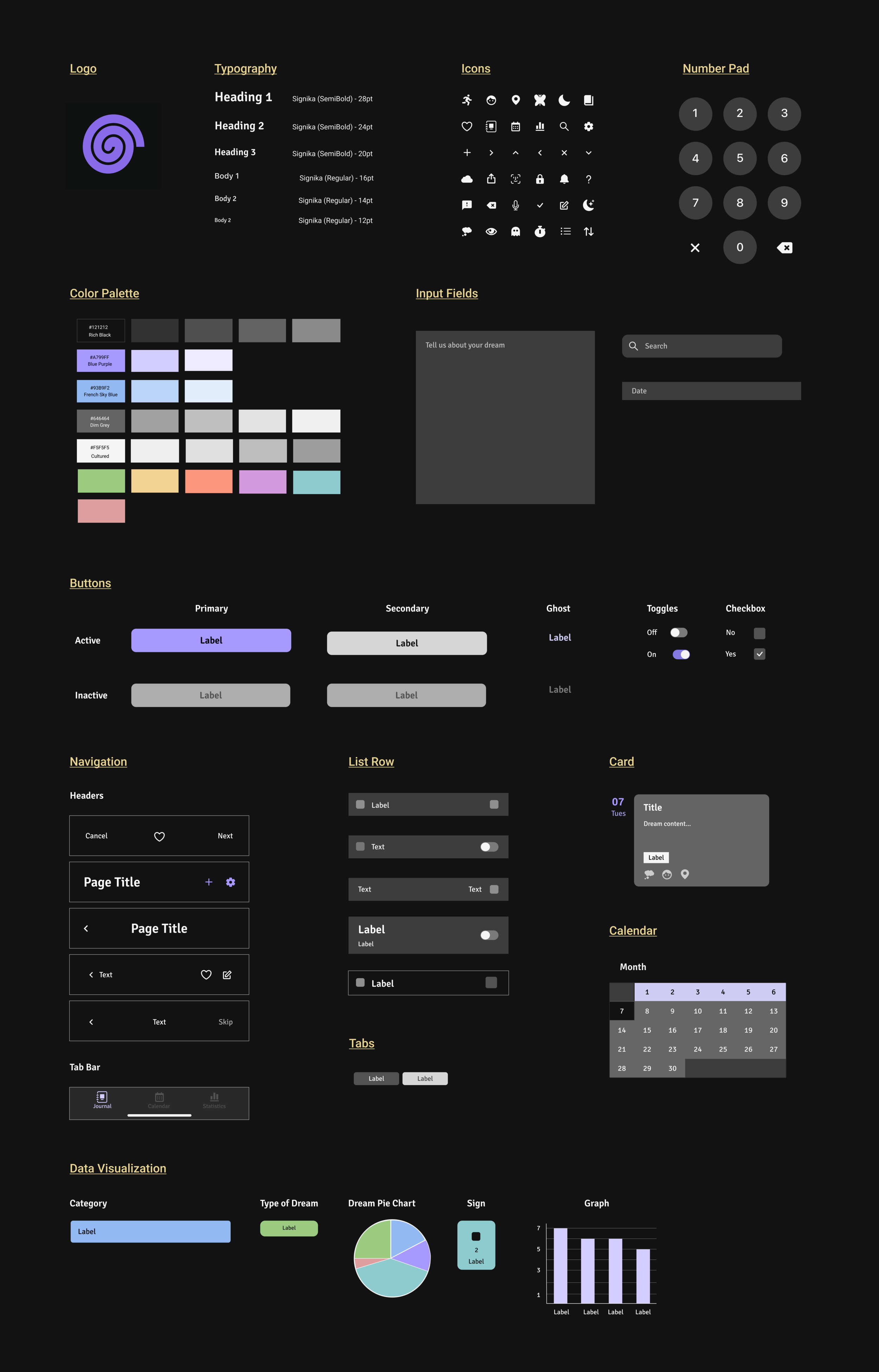
Choosing the Color Palette
Below is a list of colors I used in the app that I referenced from WCAG (Web Content Accessibility Guidelines). I used a plugin called Spark on Fligma to determine if my colors were accessible.
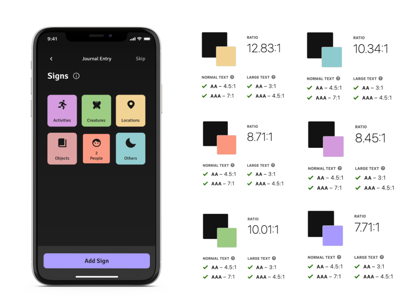
I created many components and variants on Figma for my UI Kit. I wanted my brand tone to be playful and friendly. I chose Signika for my typography because the font is sans-serif with a gentle character. To look playful, I intend to use illustrations and visualizations. The mood board provided many inspirations for my component designs. Unlike other projects, I had to ensure all the components and colors worked well in dark mode.
Initial Mobile Prototype
I took the high-fidelity wireframes and made copies of similar pages. Afterward, I incorporated the interactive states into each page and wired each state to the corresponding page. The prototype will help me conduct a usability test and observe the site’s functionalities.
I divided the prototype into 4 flows, which I will use to conduct my usability test.
Onboarding process
Adding a new journal entry
Adding a new reminder
Filtering journal entries

Verify

Usability Testing
Goals and Objectives
Identify any issues users encounter during the test.
Test the effectiveness of CTA in guiding users to complete the tasks.
Understand the users’ actions and thought processes while completing the tasks.
Methodologies
Remote Observation: Participants will share their screen on Zoom while I observe their actions during the test.
Possible Mistake
I did not start the “Add a new entry” flow with the homepage.
When I asked the participants to add a new reminder, they tapped “+” instead of the settings icon.
Participants are most likely to tap "+" if I presented the homepage when they were asked to add a new entry.
Top Concerns for Users
Not understanding certain terms (ex: Lucid)
Confused why tapping the “+” icon didn’t add a reminder
Did not know what “Characters” meant
Couldn’t find the correct filter
Successful Outcomes
CTA buttons helped users complete the onboarding, journal entry, and reminder processes.
Affinity Map
It was nice to see that all participants completed all the tasks. They liked how the icons and CTA buttons guided them through flows. Throughout the usability test, participants pointed out some confusing features and components. With that in mind, I developed an affinity map that presents opportunities to improve my prototype. I used Miro to create my affinity map because they have premade post-its that I can easily drag and edit.
Top Concerns From the Usability Test
Not understand certain terms (ex: Lucid)
Confused why tapping the “+” icon didn’t add a reminder
Did not know what “Characters” meant
Couldn’t find the correct filter
Opportunities
Add an info icon that contains term definitions
Change the wording of “characters” to something more straightforward
Understand why “+” icon confused users with adding a new reminder
Consider relocating filters
Change the filter’s layout to something easier for users to understand

Iterated Prototype
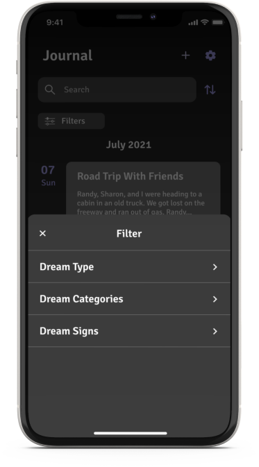
I created a filter tab and named it “Filters” to make the location straightforward. A large filter menu pulls up from the bottom of the screen and leaves lots of room for words.
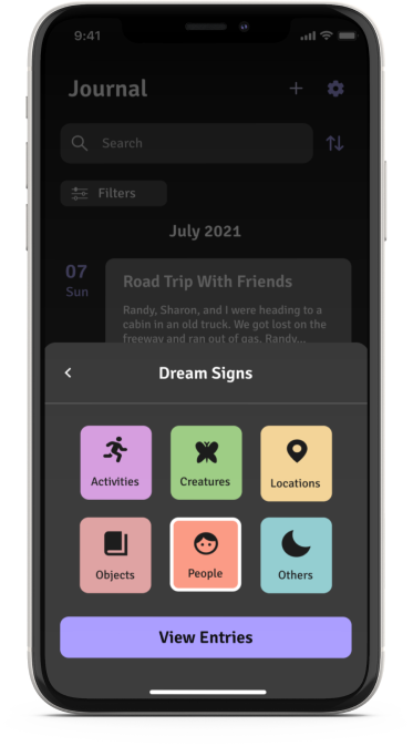
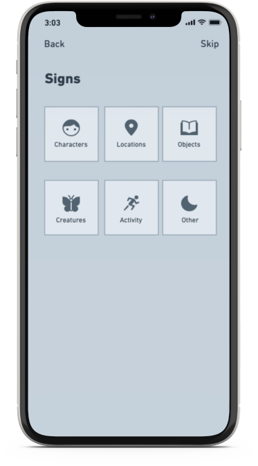
Users are taken to this page after tapping "Dream Signs". The page is visually familiar to the users. Therefore, it is easier for them to locate what they're looking for.
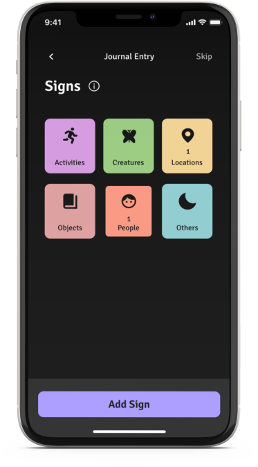
I added info icons for users who are not familiar with specific dream terms. I also changed the word “Character” to “People,” making the sign straightforward.
Check it out!
Onboarding
Adding a New Journal Entry
Creating a New Reminder
Filtering Journal Entries

Conclusion
Since I dream almost every night, I thought a dream journaling app would be useful and fun. Additionally, I was eager to work with dark mode for the first time. I had the chance to experiment with different shades of black while also exploring other colors I thought might work. For inspiration, I have been logging my dreams in a dream journaling app throughout this project. Reflecting on my dreams was an enjoyable experience, and I hope the Dream Portal can provide others with the same enthusiasm.
Lesson Learned
I need to be careful with the flows I make for my usability tests. My usability data didn't turn out well due to how my flows and pages were presented. Additionally, the way I worded my tasks affected participants' actions.
Next Steps
I will redo my usability test after considering the factors that influenced my results (changing the flows and wording of tasks) and make the necessary adjustments.
Other Case Studies
LespiCare
Where can I keep all of my seizure information in one place?

1011 Sip Tea
Responsive Website Design
Design Projects
Volunteer services and designs for social media