DoorDash - Feature With Existing Product
Allowing DoorDash customers to save and share restaurants.


⏱ Duration: 1 month
👩💻 Role: Product Designer

DoorDash is a popular food delivery service that is available in all 50 states in the USA. Their service allows customers to conveniently order food from local restaurants and have it delivered to their homes. DoorDash has a great selection of restaurants and offers a subscription for no delivery fees. The company aims to connect people by empowering local businesses.
Challenges
DoorDash is an excellent way for users to explore new restaurants. However, no feature allows customers to save restaurants they can refer to in the future. In addition, customers cannot share their favorite restaurants in DoorDash with their friends who may want restaurant suggestions.
Solution
Increase efficiency and exploration opportunities.
Find a solution that grants users the ability to keep track of restaurants and share their restaurant suggestions with others.
Design Goals
Add a bookmark feature within DoorDash
Add a sharing feature within the bookmarks list
Follow DoorDash’s existing brand
Prove that the bookmark feature can benefit users
Design Process

Discover
Research Goals
Discover why customers use DoorDash.
Understand the user’s thought process when browsing restaurants.
Determine how often users order from the same restaurants.

Competitive Analysis
I want to do a competitive analysis, mainly comparing the saving/bookmark features and observing their designs.
Indirect Competitors
Direct Competitors
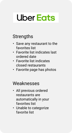
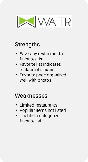
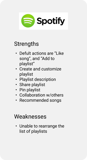
I divided the findings into similar categories. Here are some conclusions and possible ideas from this secondary research:
Users should control which restaurants to save in a category.
Default available categories like “Favorite” and “Save for Later” will help users add restaurants quickly.
Avoid automatically adding previous restaurants into a “Favorite” list.
Users can share categories with friends to view.
Users can collaborate to create a playlist.
Make sure users can rearrange their categories and restaurants.
Photos of restaurants can make the page more appealing.
User Interview
I conducted user interviews to have an in-depth conversation with the user to identify and understand the user’s thought process.
Participants
The participants are between the ages of 18-34 years old. According to online ordering statistics, the 18-24 age group orders food delivery the most, followed by the 25-34 age group with 30%. Participants should already be familiar with food delivery apps.
Goals
Discover why customers use DoorDash.
Understand the user’s thought process when browsing for restaurants.
Determine how often users order from the same restaurant.
Findings
Order from the same restaurant.
Use Doordash to find restaurants that fulfill their cravings
Use the “Orders” section to see previous orders
Order food with family and friends
Go over options with their friends until someone decides on the restaurant
Taking a long time to decide where to eat with friends
Making mental notes or writing down restaurant names to keep track of them
Trying to remember restaurants they see from social media
DoorDash’s “Favorites” list is not always accurate
Give users the ability to save restaurants
Find a way to divide saved restaurants into categories
Have sharing options so friends can prepare a list of restaurants beforehand

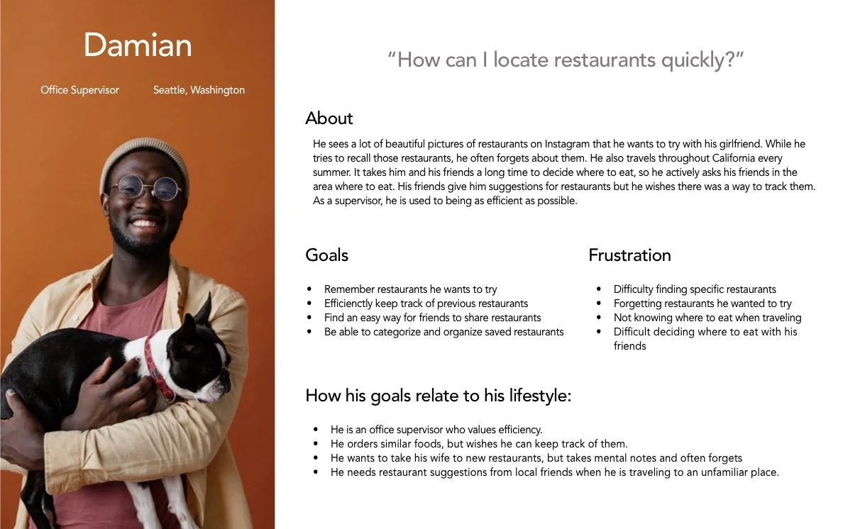
Persona
In my research, I learned that some users enjoy ordering similar foods and ordering food with friends. With so many restaurant options, deciding where to eat can take a long time. Using bookmarks, users can keep track of previously ordered restaurants or create lists of restaurants. Some users have trouble remembering restaurants so they end up making mental notes or taking down restaurant names on their notes app. Users wished there was a way to share the restaurant list with friends when they need restaurant recommendations. I made a user persona Damian who embodies the needs, frustrations, and goals.

Identify
Information Architecture
I wanted to know the best location for the bookmark feature because I’ve seen it in different areas of various apps. UberEats have the bookmarks placed within the account page, and I was curious if users can easily find the bookmarks there. There were other bookmark areas I had in mind that I wanted to try out. So I created wireframes and placed the bookmarks feature in different locations on the app.
Lo-Fi Wireframes
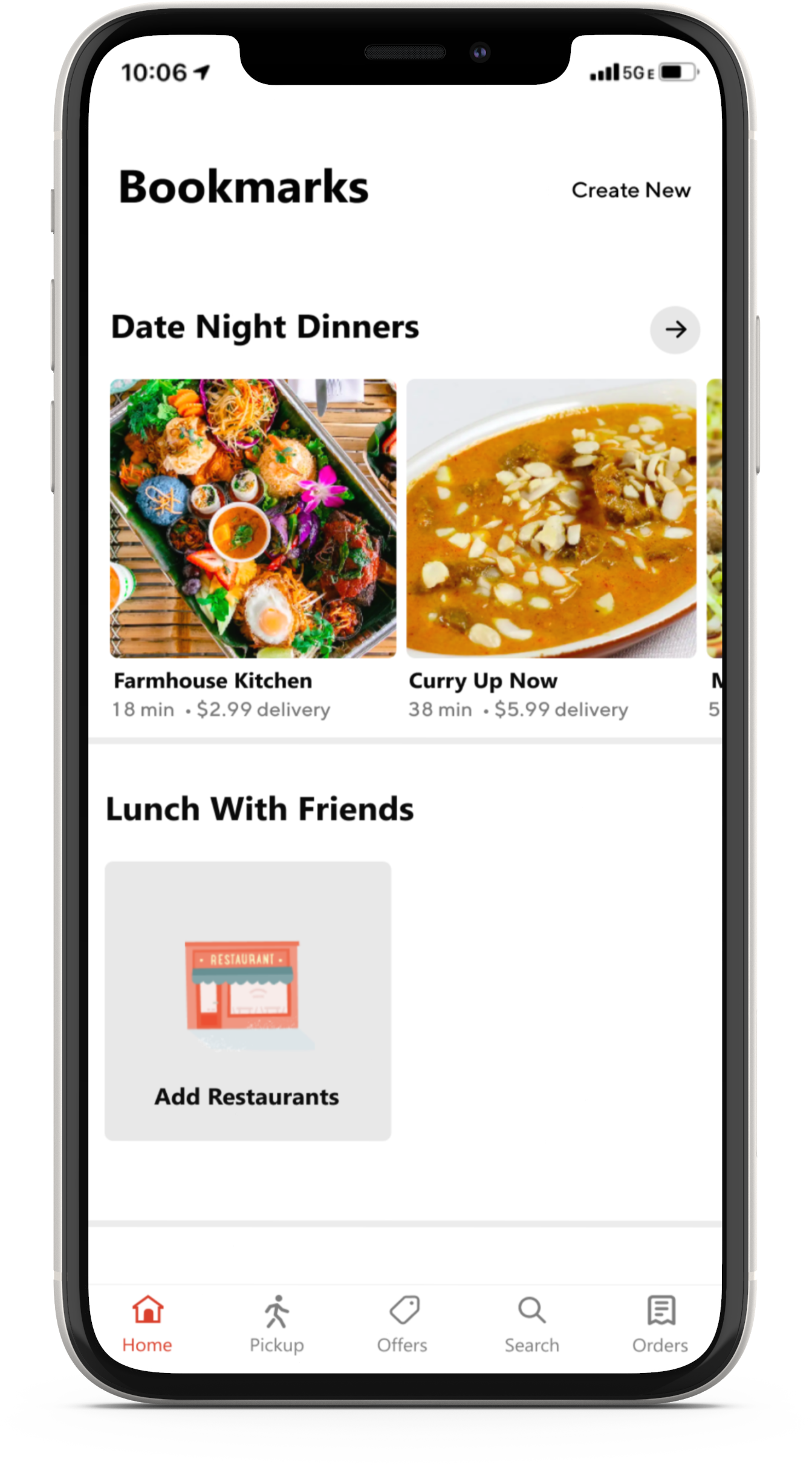
These wireframes depict four different bookmark locations, which I will use for my IA usability test. The task for these wireframes was to find the “Date Night Dinners” within the bookmarks. Click or tap on the photo to view it in detail.

Flow #1 Bookmarks Within the Account Page
Flow #2 Bookmark Icon on the Homepage

Flow #3 Bookmark Categories Throughout the Homepage

Flow #4 Bookmark on One Section on the Homepage
IA Usability Test
After creating my wireframes, I gathered participants to do a quick test to find the optimal IA. I added my screens into Maze, which is a great tool for rapid, remote testing. I used Maze to conduct this test to see areas that users misclicked and the duration of time for each participant to complete the task.
Goal
Find the best location for the bookmark feature that is usable and discoverable.
Task
Find the “Date Night Dinners” category in the bookmark list.
Rapid Remote Testing
They will complete the given task in Maze while I observe their actions. I will instruct each user to perform the same task with the 4 flows that I have created.
I used the lo-fi wireframes above to create hi-fi wireframes so I can properly display the screens in Maze.
Research Findings
Most users agreed that flow #2 had the best location to complete the task.
Flow #1: This flow had the most misclicks because users started to click random areas.
Flow #2: Users completed the task quickly (lowest duration time).
Flow #3: Users unfamiliar with scrolling down the page for bookmarks. However, once they scrolled down, the user quickly tapped the category.
Flow#4: Some misclicks and difficulty finding bookmarks location
Confusion During the Test
Participants unfamiliar with Maze found the instructions in the rapid remote testing to be confusing. Participants failed to read the directions regarding Maze at the start of the test, so they were puzzled as to why clicking certain spots had no effect. As a result, they clicked everywhere on Flow #1. Because Flow #2 was more direct and straightforward, participants were better able to understand how Maze functions.
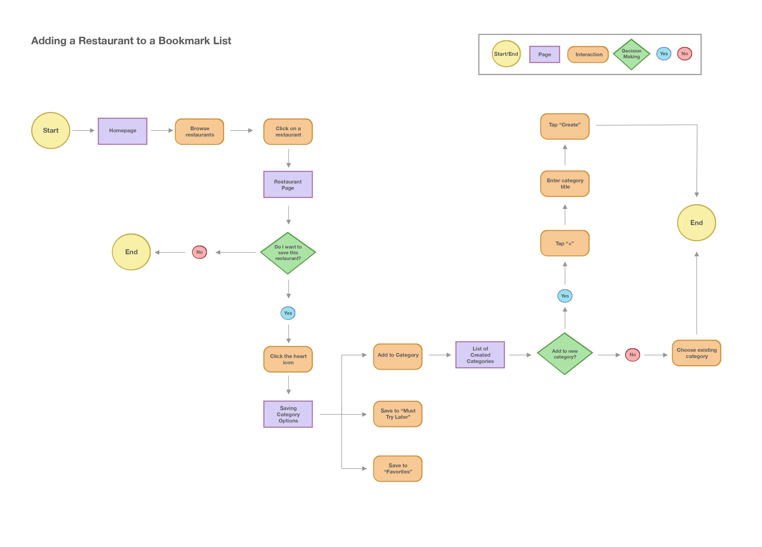
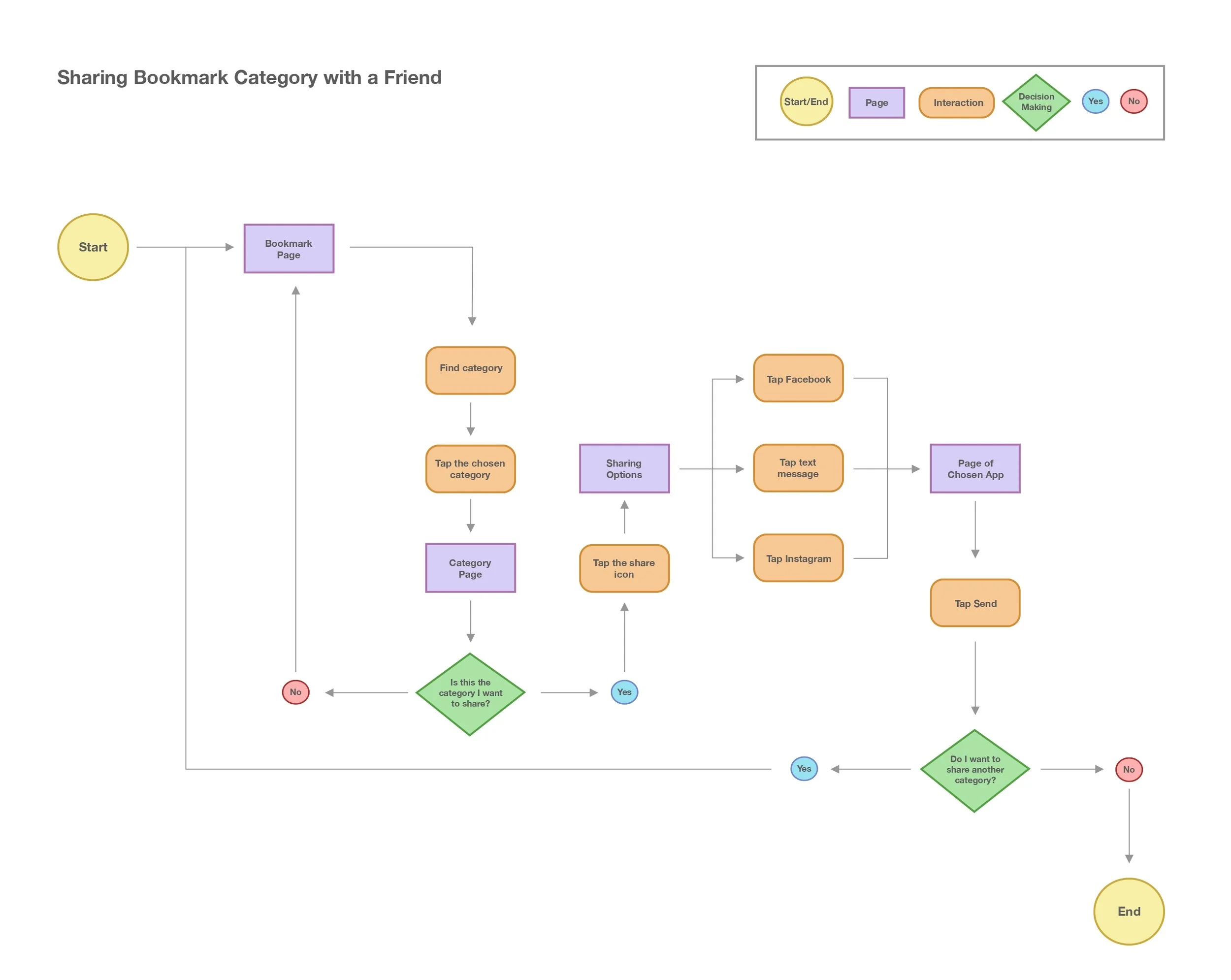
User Flows
I created four flows that demonstrate different actions used for this bookmark feature. User flows will help me understand the user’s process by illustrating ways a user could complete these tasks. Click or tap on a flow to view.
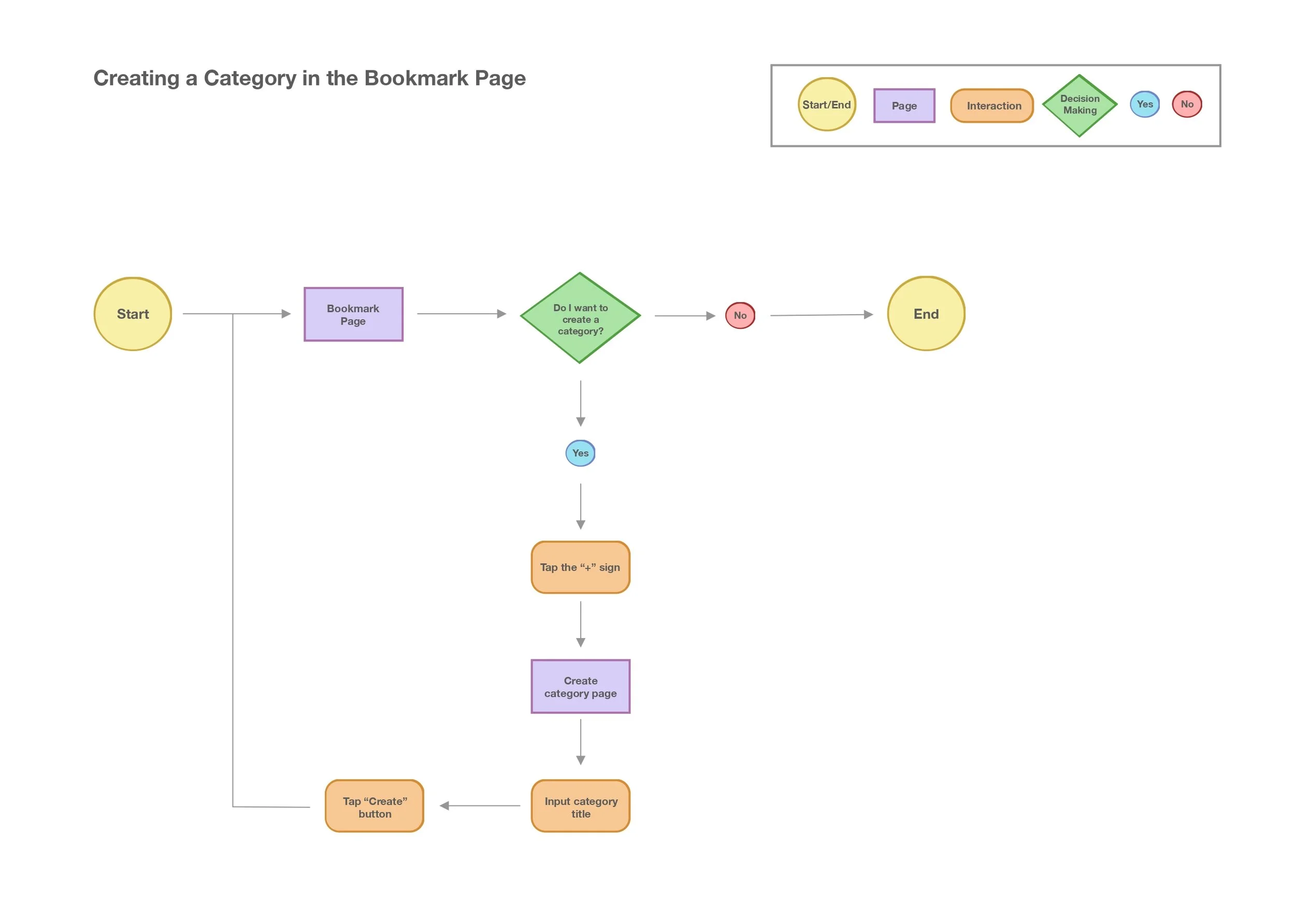
2. Creating a Category in the Bookmark Page
1. Adding a Restaurant to a Bookmark List
3. Sharing Bookmark Category with a Friend
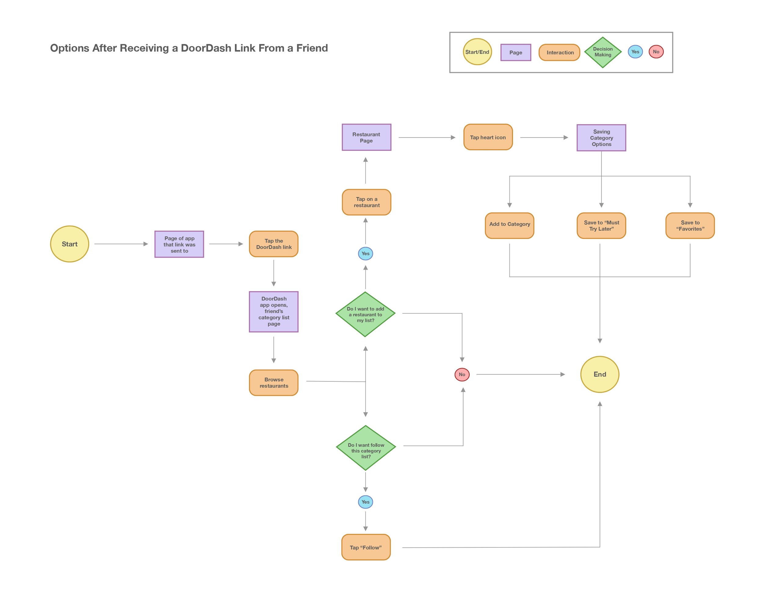
4. Receiving a DoorDash Link From a Friend

Design

Mood board
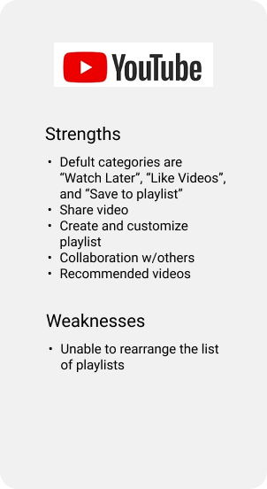
I wanted to gather some inspiration on setting up other parts of the app, such as the bookmarks page and its content. I chose to find inspiration from Spotify and Youtube because they were indirect competitors for my competitive analysis. I also chose Yelp because their app consists of many restaurants and has a collections page.
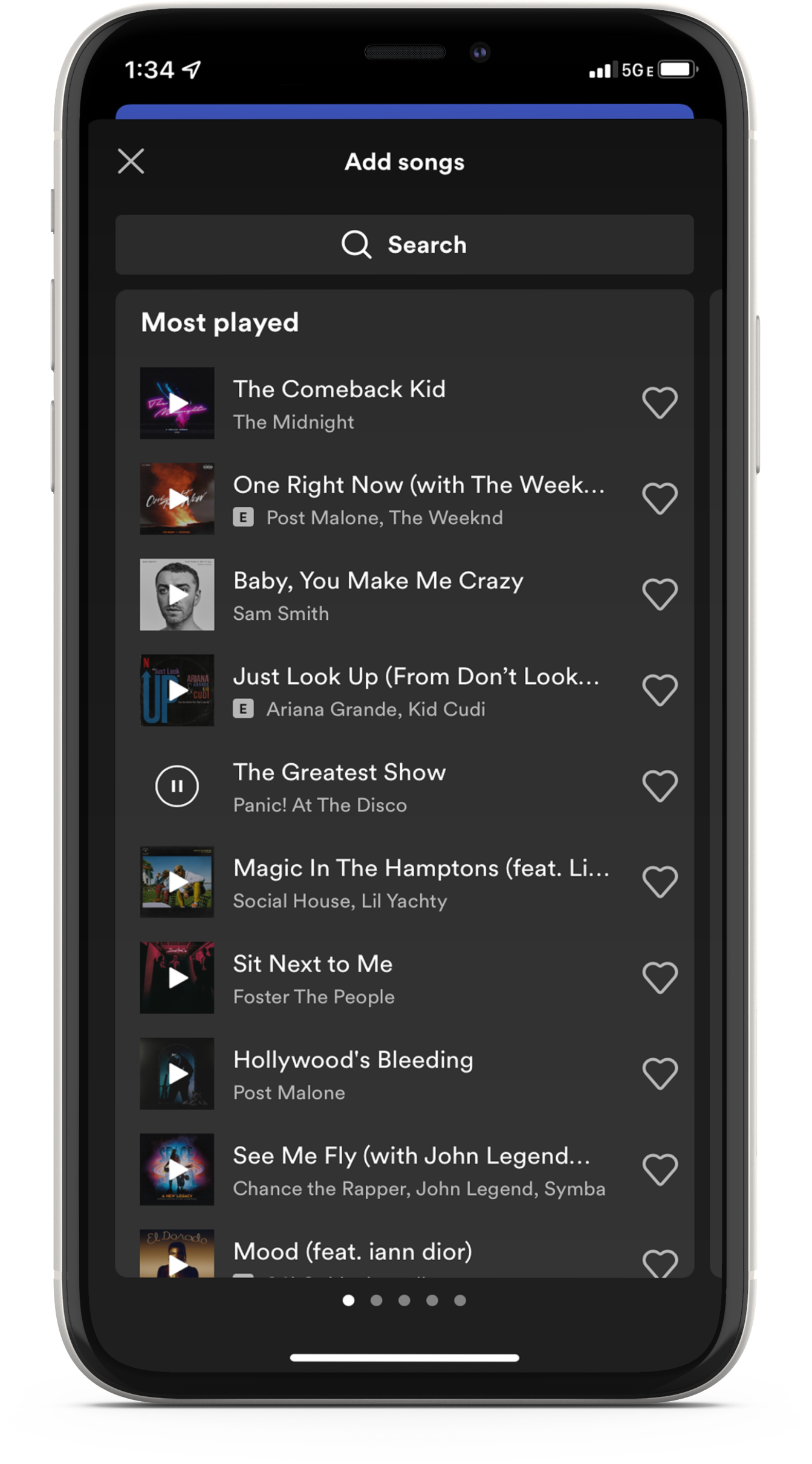
I love Spotify’s “add songs” layout because it looks organized and straightforward. Users can use the search bar or tap the plus icon to add a suggested song to a playlist.
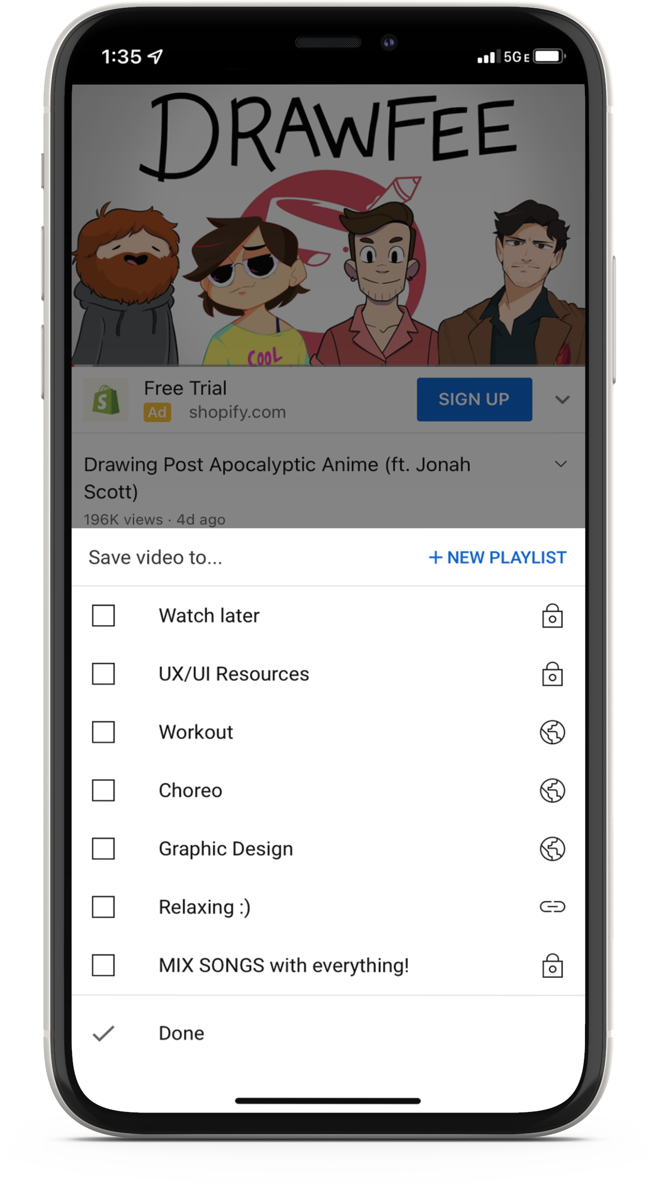
Youtube makes it easy to add videos to an existing playlist. I like how Youtube automatically creates the “Watch later” playlist since it is a typical playlist user will make.
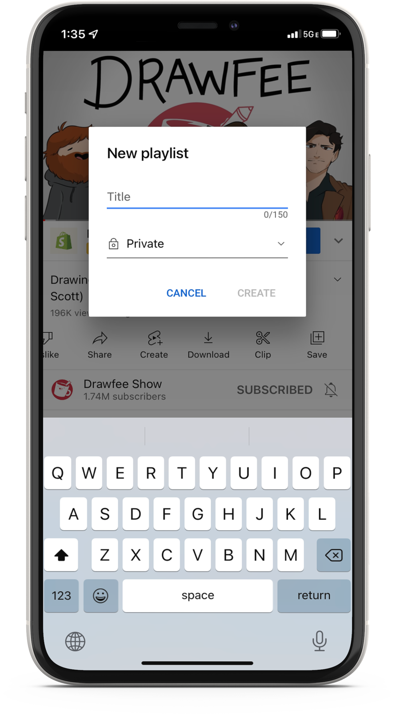
I like how simple Youtube’s new playlist box looks and how it stands out in front of the dark opacity background.
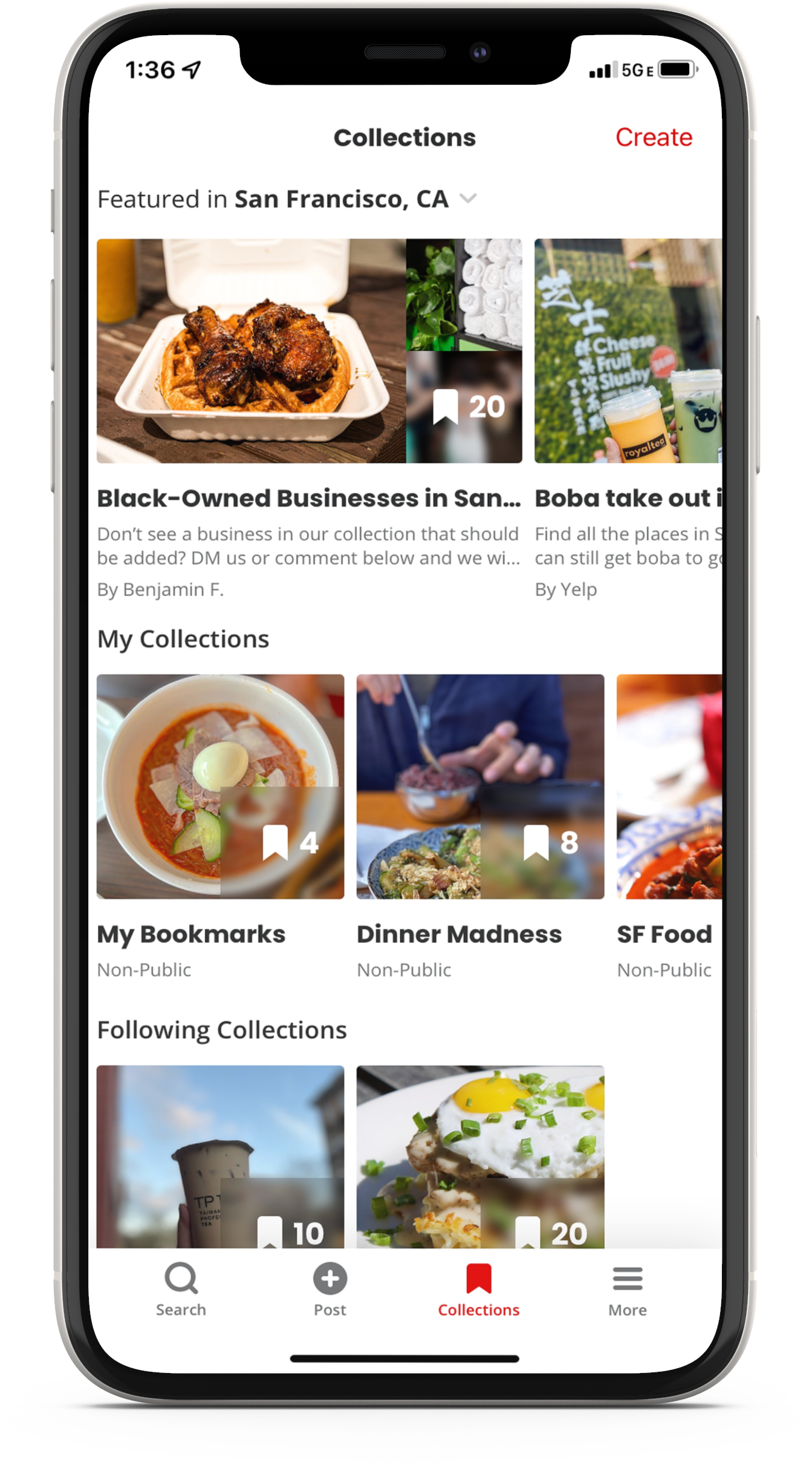
I love the way Yelp organized their collections page, which is their version of bookmarks. I like how each restaurant's images are displayed and how the restaurants are categorized.
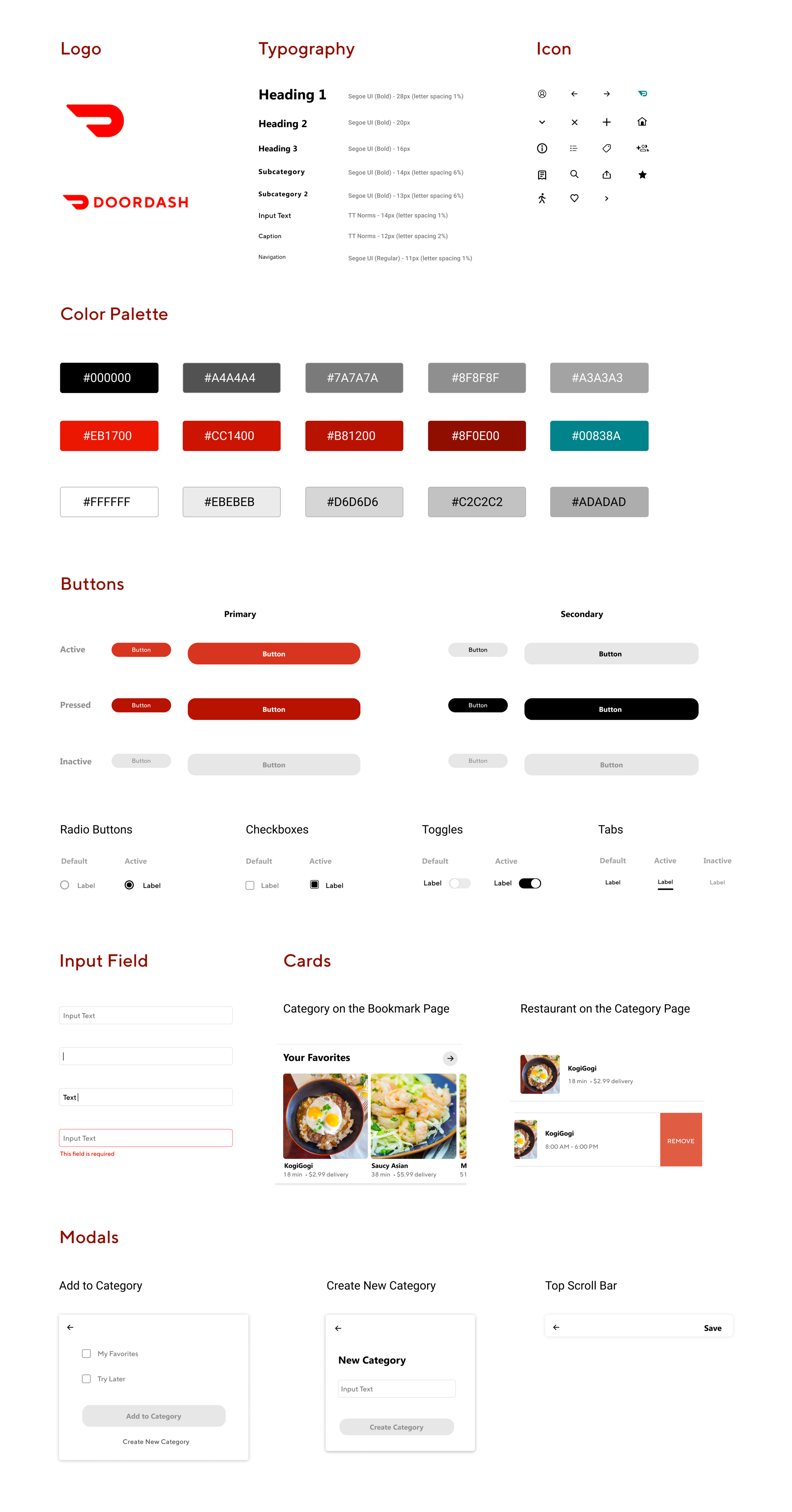
UI Kit
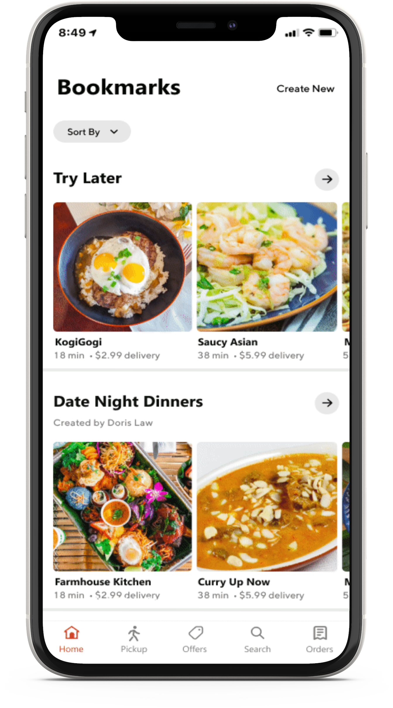
After gathering some layout inspiration from my Moodboard, I created my own modal and card designs. Other parts of the UI Kit are components from the DoorDash app. I can reference these components throughout my project to make sure elements align with the branding and app.

High Fidelity Wireframes
After defining the information architecture and UI components, I created high-fidelity wireframes to represent the end product visually.
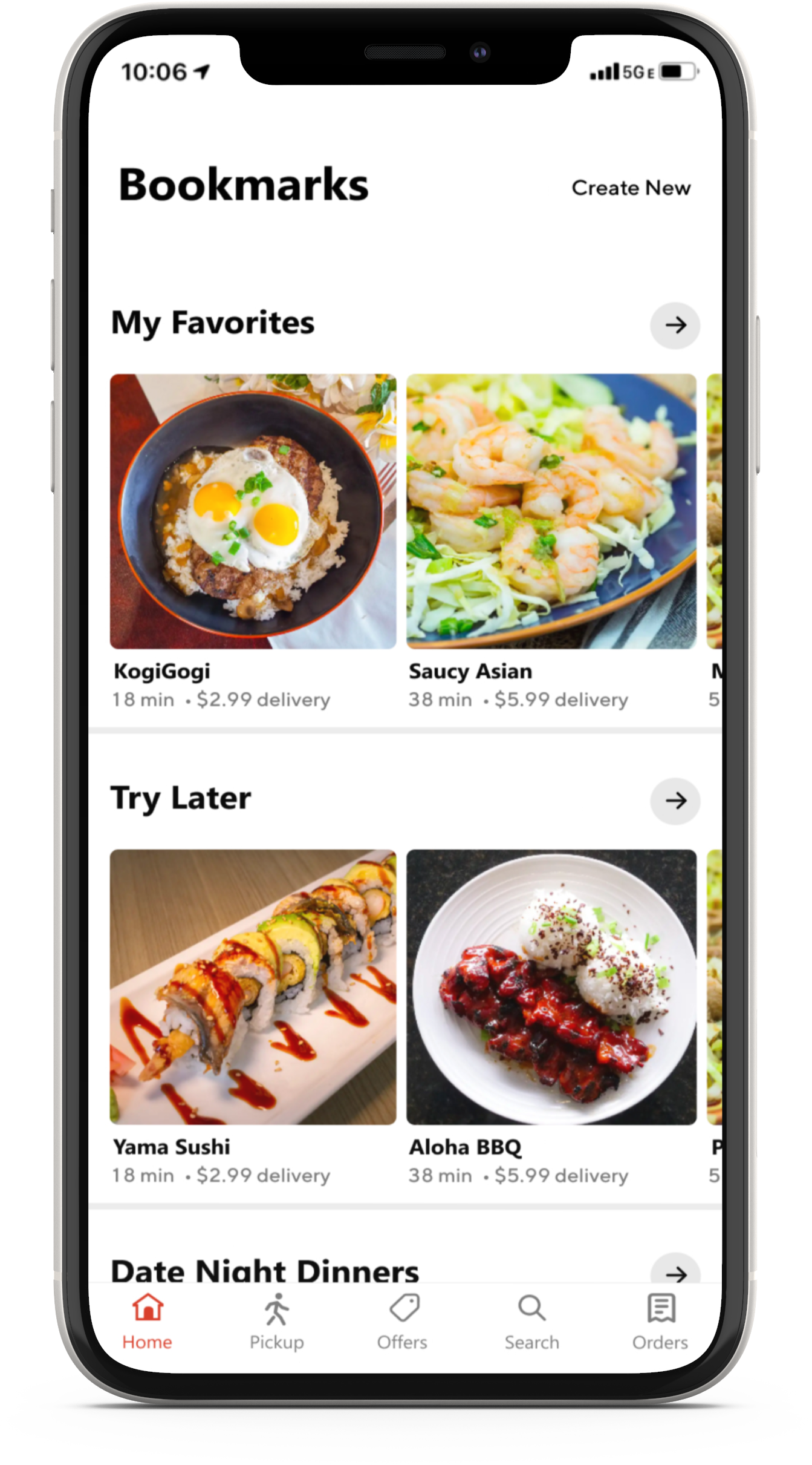
Users will tap “Create New” to create a new category.
The right arrow let’s the user see more restaurants within that category.
User taps “Add Restaurant” after creating a new category.

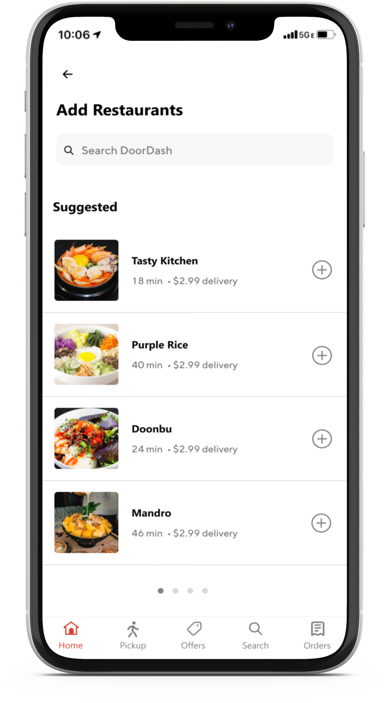
User taps “Add Restaurant” and a list of suggested restaurants appears
User taps “+” to easily add the restaurant to the category.
The user can swipe left on the list for more restaurants
(Suggested →Most Popular).
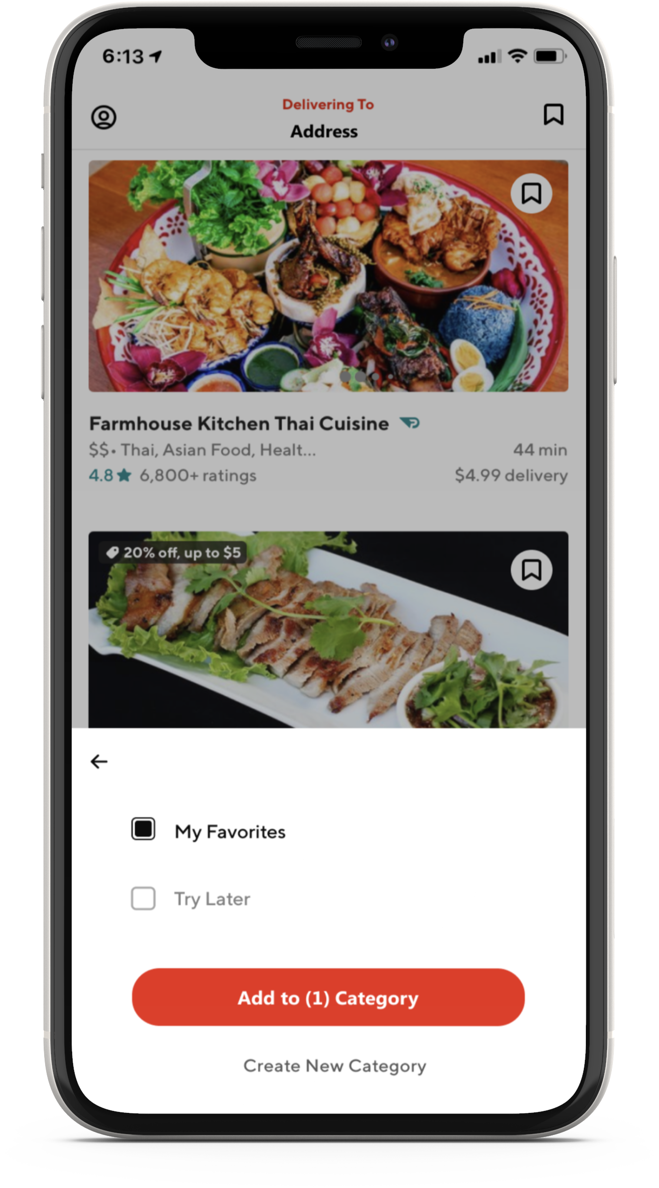
The bookmark icon is located at the top right corner next to the sharing icon.
When a user is adding a restaurant to an existing category, they will tap the category. A black box will appear to show that it was selected.
To create a new category, tap “Create New Category”.
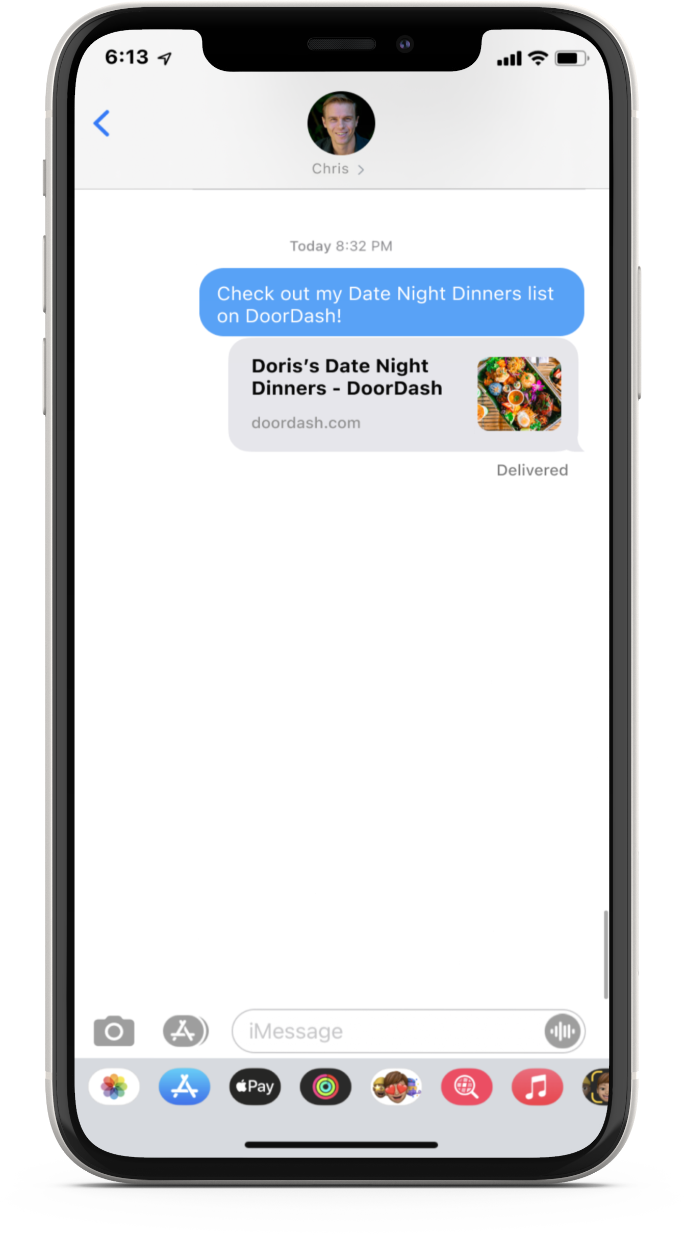
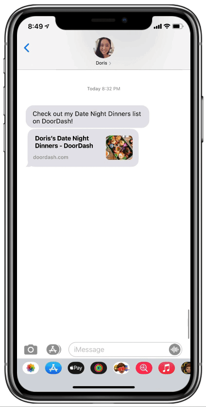
User can share their Doordash bookmark with their friends.
The user’s friend can tap on the link, which will pull up the user’s “Date Night Dinner” list.
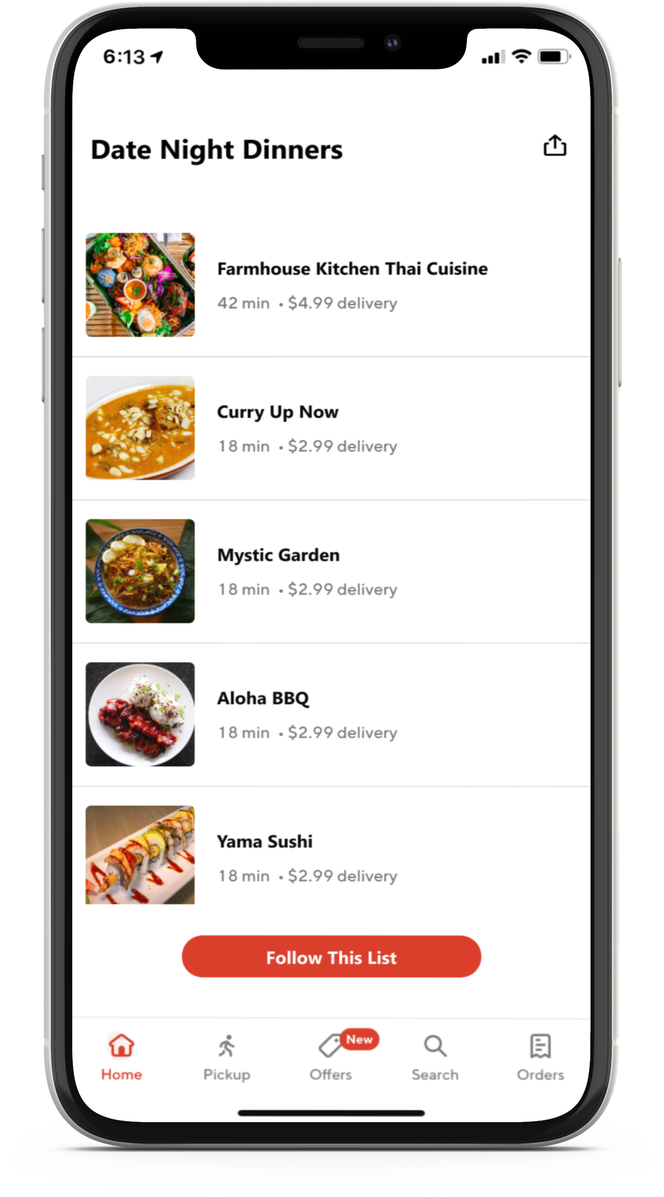
The user’s friend can follow the user’s list at the end of the list.
Initial Mobile Prototype
I conducted my usability testing with a prototype to see any room for improvement and observe the site’s functionalities. The prototype consists of four tasks to test the usability of the bookmark category-creating, sharing, and following features. I divided the frames into four scenarios that I created from the user flows.

Verify

Usability Testing
Goals and Objectives
Identify issues participants come across while completing the tasks.
Understand the participant’s thought processes while completing the tasks.
Determine if participants can easily spot the appropriate buttons to complete the tasks.
Methodologies
Remote Observation: Participants will share their screen on Zoom while I observe their actions throughout the test.
Participants
The participants are between the ages of 18-34 years old. According to online ordering statistics, the 18-24 age group orders food delivery the most, followed by the 25-34 age group with 30%. Participants should already be familiar with food delivery apps.
Scenarios
I gave participants four scenarios and tasks that tackle the efficiency and usability of the bookmark feature.
You can check out these scenarios by viewing the detailed usability testing plan here.
Test Findings
One participant didn't realize that the bookmark category could be created on the bookmarks page. This participant thought that the only way to create a new category was after bookmarking a restaurant. One participant mentioned possibly having a sorting option in bookmarks to help users find their lists easily. Another participant reported not expecting the "Follow This List" button at the end of the list. She suggested placing it at the top so users do not have to scroll to follow it.
The participants all agreed that this was how DoorDash would've implemented the bookmark feature. They said it was well organized and fit in with the overall look of DoorDash. The buttons were easily accessible and guided them through the tasks. Participants appreciated the unique aspects of this feature, like the option to share bookmarks with their friends. Participants wished this was a real feature because it was helpful, straightforward, and easy to use.
Affinity Map
I gained valuable insight into participants’ thought processes in navigating through the new bookmark feature from the usability testing. I received some positive feedback about the simplicity of creating a category and the overall idea of having this feature. Participants also provided excellent suggestions to consider that will become great opportunities for me to improve my prototype.
Opportunities
Consider relocating the “Follow This List” button
Consider sorting options on the bookmarks
Top Concerns for Users
I did not include issues that were unrelated to the feature.
“Follow This List” should not be below the last restaurant in the list.
I wish there were a way to sort the bookmark list.

Iterated Prototype
Based on the opportunities I discovered from the Affinity Map, I made some iterations to the prototype. I asked a friend who had an Android phone to pull up his DoorDash app. The share button on the restaurant’s page was missing. It surprised me that there was no sharing option available in DoorDash for Android phones.
I added a “Sort By” button on the bookmarks page, and I moved the “Follow This List” button to the bottom of the page, as shown below. The “Follow This List” is a sticky button, which means it stays in place while the users scroll up and down the page.
I added a “Sort By” button on the bookmarks page
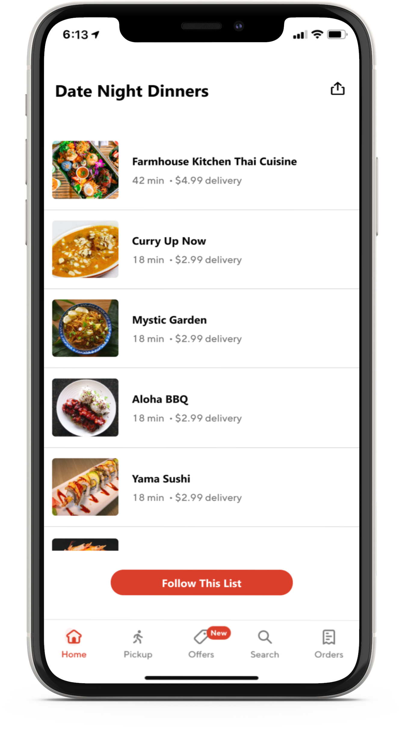
The “Follow This List” is a sticky button, which means it stays in place while the users scroll up and down the page.
Check it Out!
Adding a Restaurant to a New Category.
Sharing a Bookmark List
Following a Friend’s Bookmark List

Creating a New Category in the Bookmark List

Conclusion
In these current times, I would like to create an app to help people and businesses. I immediately thought of DoorDash, which I use frequently to support local restaurants. In addition, I wanted to work with an app I was already familiar with to develop features that I wanted the app to have.
Lesson Learned
Participants unfamiliar with Maze found the instructions in the rapid remote testing to be confusing. Participants failed to read the instructions regarding Maze at the beginning of the test. As a result, they clicked everywhere on Flow #1. Participants seemed to understand how Maze worked better with Flow #2, since it was more straightforward for them to follow.
Next Steps
I will reexamine the Information Architecture test by observing participants remotely while they use Maze. Remote observation allows me to clearly explain to participants what steps they need to take when using Maze. Additionally, I can figure out the participants' thinking processes as they complete the tasks. Then I will conduct another usability test and make any necessary changes.
Other Case Studies
Dream Portal
End-to-End Mobile App
MSEI - Renamic Neo
Component Library
1011 Sip Tea
Responsive Website Design