DoorDash - Feature With Existing Product
Year: 2021
Duration: 3 weeks
Project: DesignLab’s UX Academy
Role: Research, UX/UI Designer
Tools: Figma, Miro, Zoom, Whimsical, Maze
Background
DoorDash is a food delivery service that allows users to order food and drinks from restaurants in their area. DoorDash was founded in February 2013, and its headquarters are located in San Francisco, California. Standford students Andy Fang, Stanley Tang, Evan Moore, and Tony Xu were the founders of DoorDash. The company aims to connect people with the best in their cities by empowering local businesses.
The Challenge
DoorDash has many restaurants available, making it an excellent way for users to try new restaurants. However, DoorDash does not have any feature that allows users to save restaurants they can refer to in the future. In some scenarios, some users do not know what restaurants to try, so they reach out to their friends for suggestions.
I want to find a solution that grants users the ability to keep track of restaurants and share their restaurant suggestions with others.
Design Goals
Add a bookmark feature within DoorDash
Add a sharing feature within the bookmarks list
Follow DoorDash’s existing brand
Prove that the bookmark feature can benefit users
Design Process
Empathize
Engage with the people I’m designing for in order to understand their experiences and needs.
Define
Analyze my observations and define the core problems.
Ideate
Identify alternative ways of viewing the problem and look for new solutions.
Prototype
Produce versions of the product to investigate the solutions.
Test
Test the product using the solutions during the prototyping phase.

Empathize
Competitive Analysis, User Research, Persona
Research Overview
Research Goals
Discover why customers use DoorDash.
Understand the user’s thought process when browsing restaurants.
Determine how often users order from the same restaurants.
Methodologies
Competitive Analysis
Compare design features with other competitors. See if other competitors have a saving/bookmark feature and observe how it is designed.
User Interviews
Have an in-depth conversation with the user to identify and understand the user’s thought process.
Competitive Analysis
Indirect Competitors
Direct Competitors
Findings
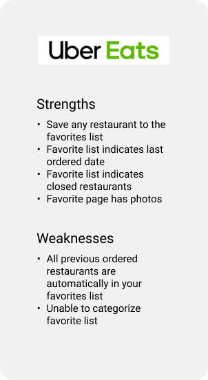
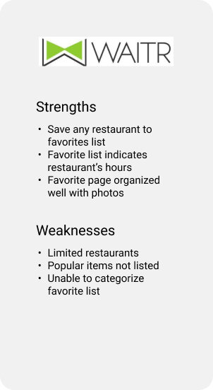
Delivery services are growing tremendously. More restaurants are partnering up with food delivery services to attract more customers. Popular food delivery services such as DoorDash, UberEats, and GrubHub have many restaurants and users. Since there are many restaurants, it is essential to find and track them quickly. My focus for this competitive analysis is to compare various apps’ saving features. Having a bookmark or favorite list will help users keep a record of their restaurants. Here are some findings and ideas from the secondary research.
The ability to categorize restaurants and items make it easy for users to find them.
The ability for users to control which restaurants to save will help users keep track of them.
Default available categories “Favorite,” “Save for Later,” “Add to List” makes it easy for users to add restaurants to a category quickly.
Having “Favorite,” “Save for Later” categories on the home page gives users easy access.
Do not automatically add previously ordered restaurants to the user’s “Favorite” list because not all restaurants are their favorite.
Collaboration with other users gives the ability for multiple users to contribute to a category together.
Share categories with users to view.
Make sure that users can rearrange their categories and restaurants to their preferences.
Photo of each restaurant will make the page appealing.
Indicate if a restaurant is available.
User Interview
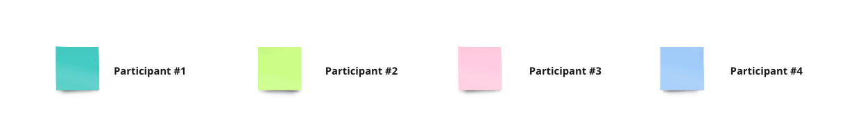
Participants
Between 21-35 years old
Familiar with food delivery apps
Research Debrief
You can view the Interview Guide and Interview Findings.
Users use DoorDash to find restaurants that fulfill their cravings.
Most participants tend to order from the same restaurant.
Most participants used the “Orders” section to find previous orders.
Most participants ordered from restaurants within similar categories.
Half of the participants browse for new restaurants based on trends and social media.
Most participants claimed they order food with friends/family all the time.
Most participants go over options with their friends until someone decides.
Taking a long time to decide where to eat with friends and family
Taking mental notes or writing down restaurant names to keep track of them
Trying to remember restaurants they see from social media
DoorDash’s “Favorites” section is not always accurate.
Give users the ability to save restaurants
Find a way to divide saved restaurants into categories
Have sharing options so friends can prepare restaurants beforehand
Persona
From the research, I learned that some users enjoy ordering similar foods and ordering food with friends. Since there are so many restaurant options, it can take users a long to decide where to eat. Bookmarks can help users prepare a list of restaurants or keep track of previously ordered restaurants. The bookmarks list can give the users the ability to create categories and organize their lists, increasing efficiency. Outside of food delivery, DoorDash can also provide a list of restaurants to try out in person. Once users create their list of restaurants, they can share it with other friends when they need restaurant suggestions. I made a user persona Damian who embodies the needs, frustrations, and goals.

Define
HMW, Information Architecture, and Flows
How Might We Problem Statements
Sophia is visiting San Francisco for a week and wants to make sure she tries out popular restaurants there. She knows a friend who lives in San Francisco who may provide her with food suggestions.
Persona: Sophia
Need: Food suggestions
Insight: Does not know where to eat in San Francisco
How might we find Sophia a quick way to access her friend’s favorite restaurants?
How might we help Sophia keep track of restaurants she wants to try in San Francisco?
Travis has a couple of nice restaurants he wants to try out with his wife, but he might not remember them.
Persona: Travis
Need: A nice restaurant
Insight: Keeps mental notes but forgets
How might we help Travis track down restaurants he wants to try?
How might we help Travis prepare a list of nice restaurants to try with his wife?
Roger wants his friend to try out a fantastic restaurant that he ordered from 2 months ago, but he does not remember the restaurant’s name.
Persona: Roger
Need: Find a specific restaurant
Insight: Cannot remember the name of a specific restaurant he ordered from
How might we help Roger find the restaurant easily?
How might we find Roger a convenient way to organize his restaurants so he can quickly find them next time?
Information Architecture
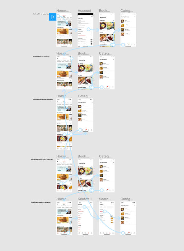
I wanted to know the best location for the bookmark feature because I’ve seen it in different areas of various apps. UberEats have the bookmarks placed within the account page, and I was curious if users can easily find the bookmarks there. There were other bookmark areas I had in mind that I wanted to try out. So I created wireframes and placed the bookmarks feature in different locations on the app.
Lo-Fi Wireframes
To create my wireframes, I used a convenient tool called Whimsical for the first time. Whimsical comes with frames and an excellent library of elements like icons, buttons, shapes, inputs, and more. I can drag pieces into frames to create page layouts quickly. They have a connector ability so that I can display interactions between screens. Here are a few lo-fi wireframes that I created using Whimsical. These wireframes depict four different bookmark locations, which I will use for my IA usability test.

Flow #1 Bookmarks Within the Account Page
Flow #2 Bookmark Icon on the Homepage

Flow #3 Bookmark Categories Throughout the Homepage

Flow #4 Bookmark on One Section on the Homepage
IA Usability Test
After creating my wireframes, I gathered participants to do a quick test to find the optimal IA. I added my screens into Maze, which is an excellent tool for rapid, remote testing. I used Maze to conduct this test to see areas that users misclicked and the duration of time for each participant to complete the task.
Goal
Find the best location for the bookmark feature that is usable and discoverable.
Task
Find the “Date Night Dinners” category in the bookmark list.
Methodologies
Remote Observation: The user will share their screen through Zoom. They will complete the given task in Maze while I observe their actions. I will instruct each user to perform the same task with the 4 flows that I have created.
I used the lo-fi wireframes above to create hi-fi wireframes so I can properly display the screens in Maze.
Research Findings
Users did not immediately click on the account icon on flow #1.
Users all completed the task on flow #2 quickly.
Flow #2 had the lowest duration time.
Users all completed the task on flow #3 easily.
Some users said the location of bookmarks in flow #3 was odd.
Flow #4 was difficult to find for some users.
Most users agreed that flow #2 was the best location to complete the task easily.
You can find detailed research results here.
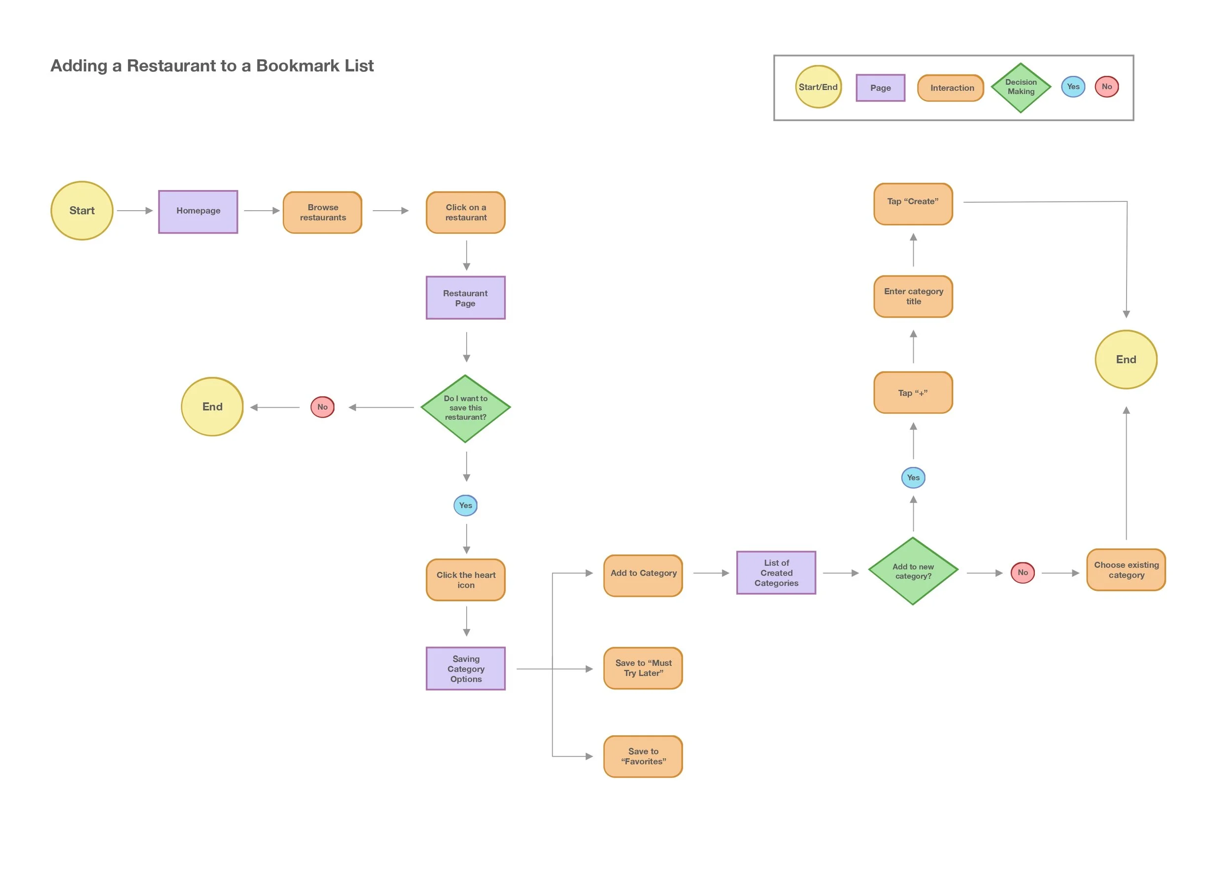
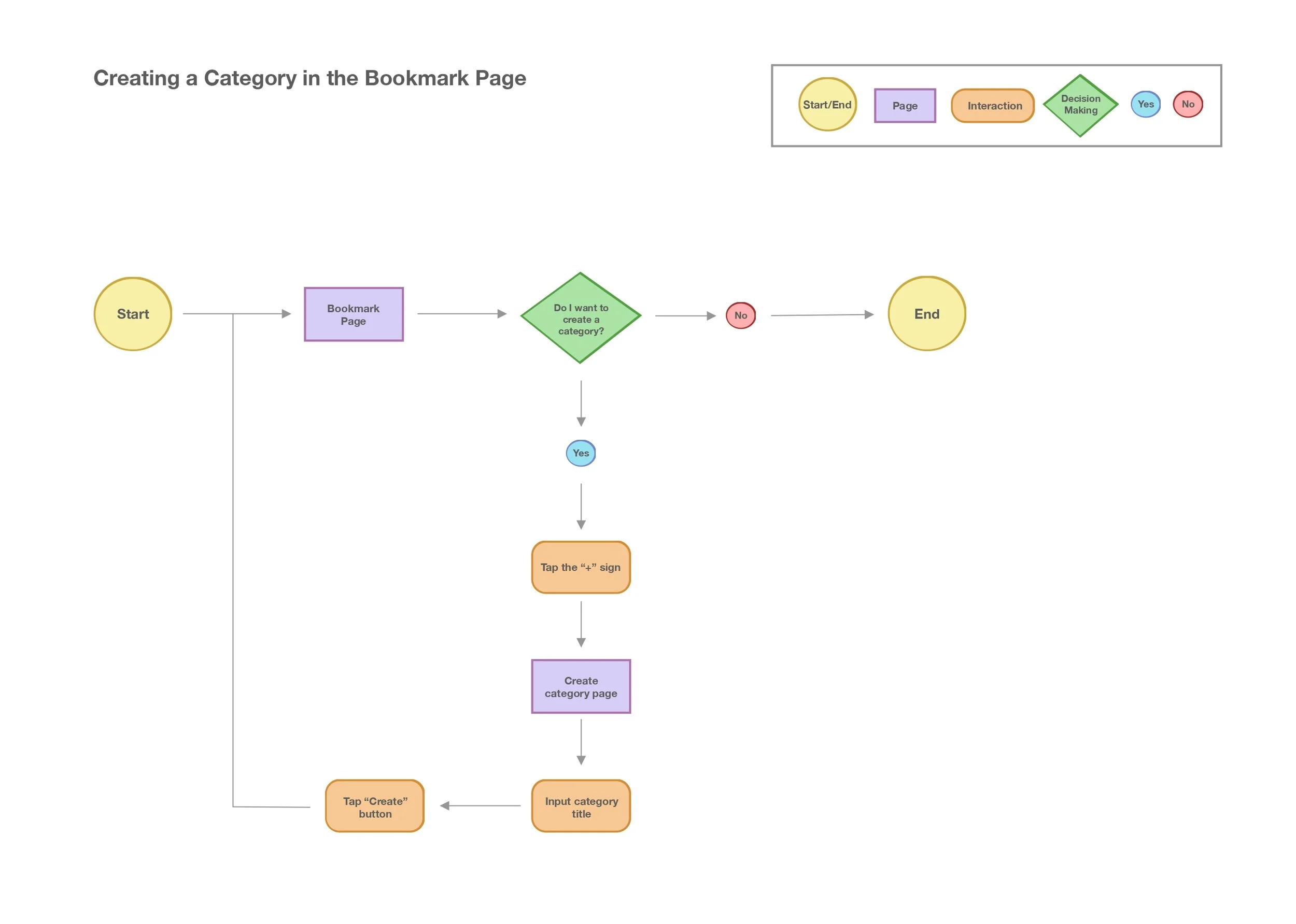
User Flows
I created four flows that demonstrate different tasks. This will help me understand the user’s process by illustrating ways a user could complete their task. Click or tap a flow to view.
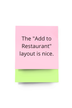
Adding a Restaurant to a Bookmark List
Creating a Category in the Bookmark Page
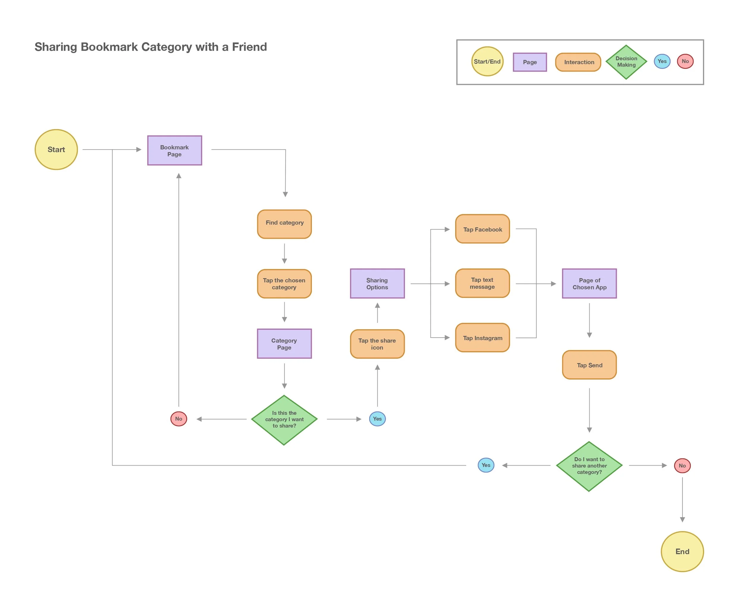
Sharing Bookmark Category with a Friend
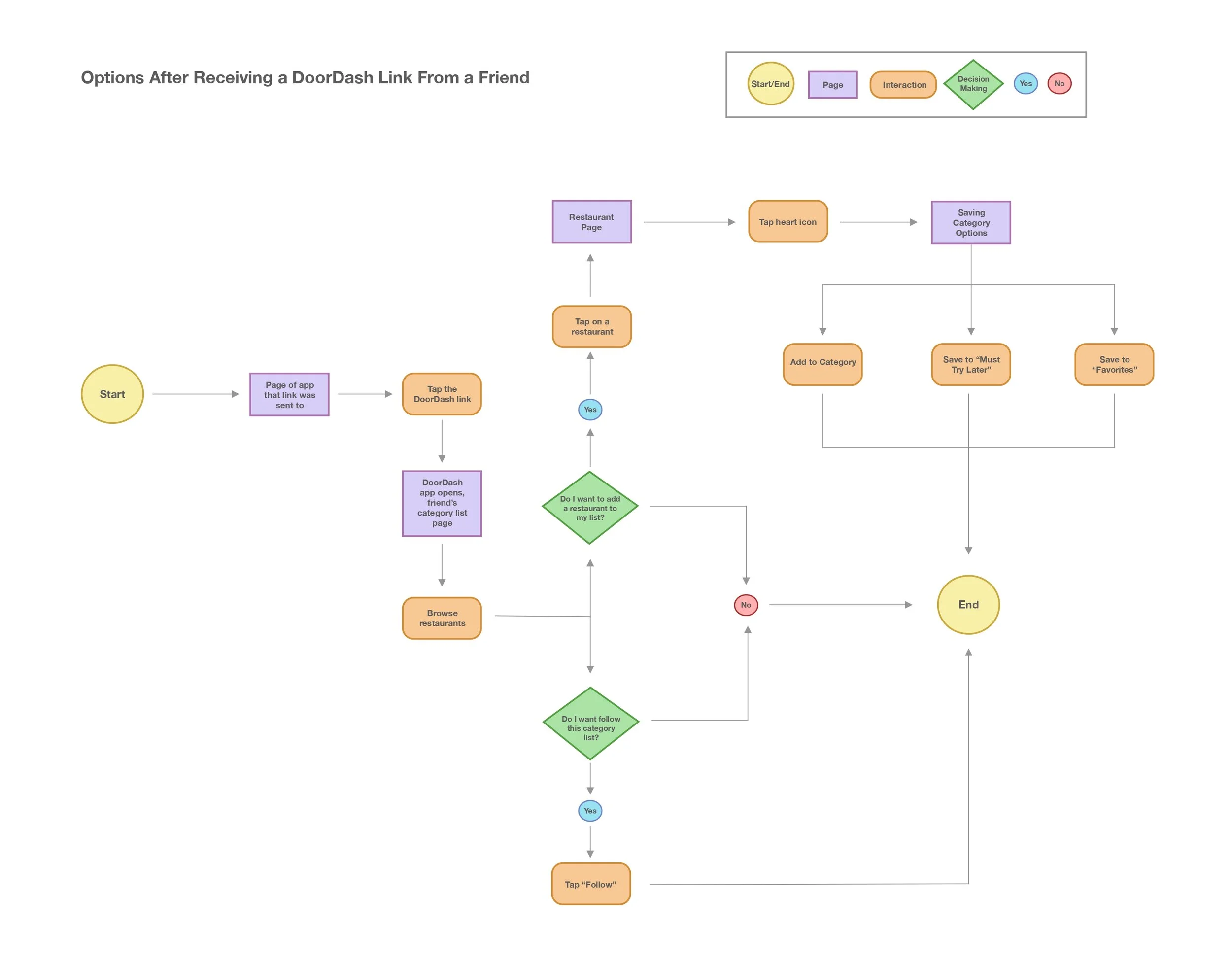
Options After Receiving a DoorDash Link From a Friend

Ideate
Moodboard, UI, Wireframes
Mood board
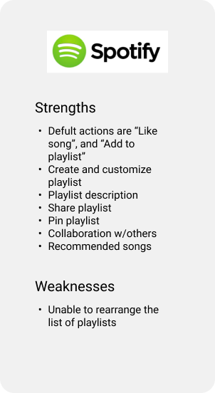
I needed to gather some inspiration on setting up other parts of the app, such as the bookmarks page and its content. I collected most of my inspiration from Spotify, Youtube, and Yelp. I chose Spotify and Youtube because they were indirect competitors for my competitive analysis. In addition, I decided Yelp because their app consists of many restaurants and has a collections page.
Spotify
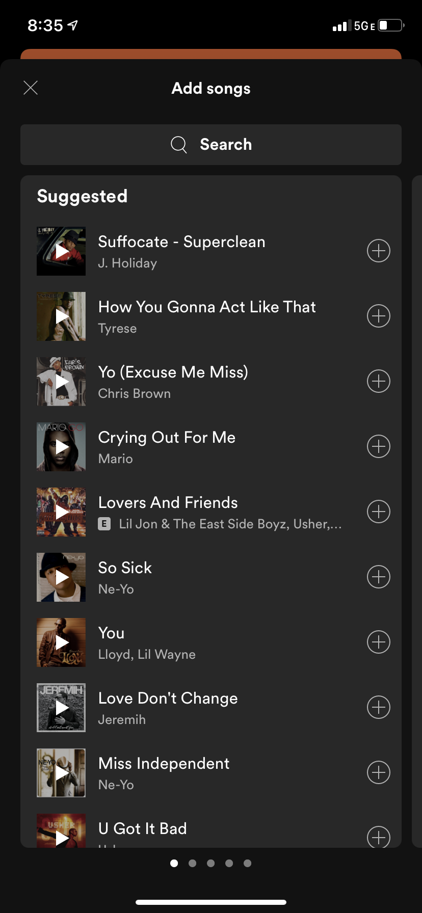
I love Spotify’s “add songs” layout because it looks organized and straightforward. Users can use the search bar or tap the plus icon to add a suggested song to a playlist.
Yelp
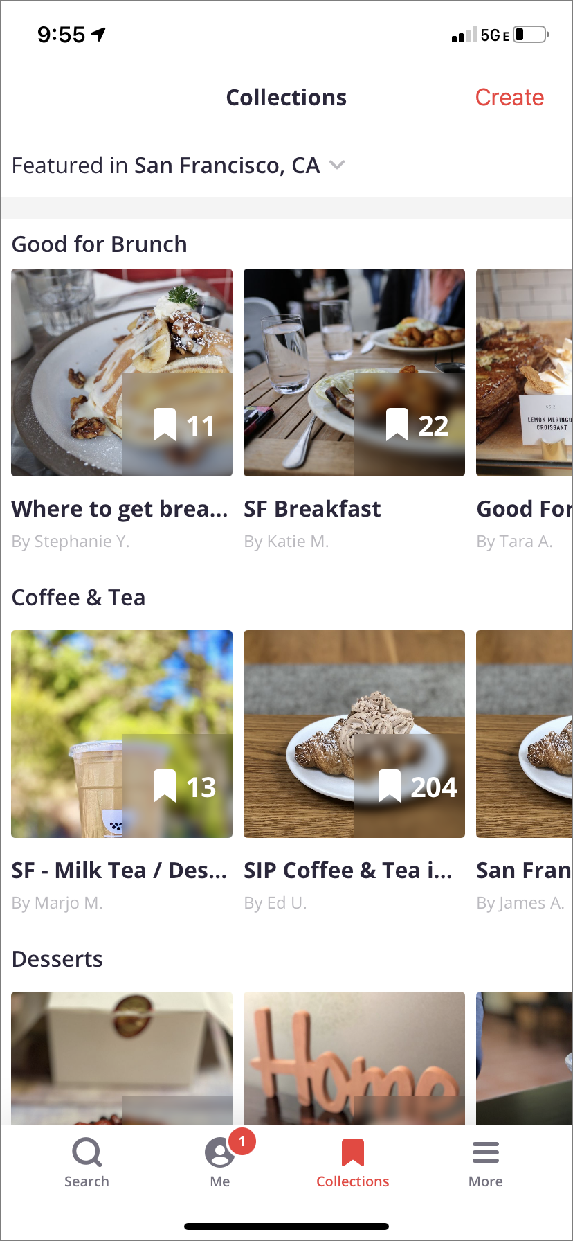
I love the way Yelp organized their collections page, which is their version of bookmarks. I like how each restaurant's images are displayed and how the restaurants are categorized.
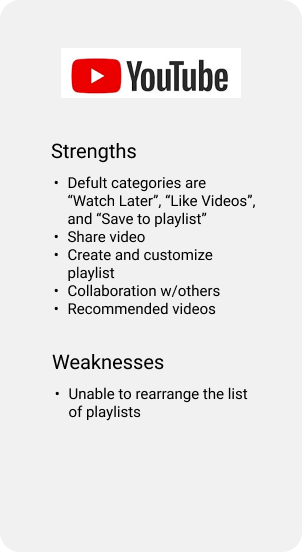
Youtube
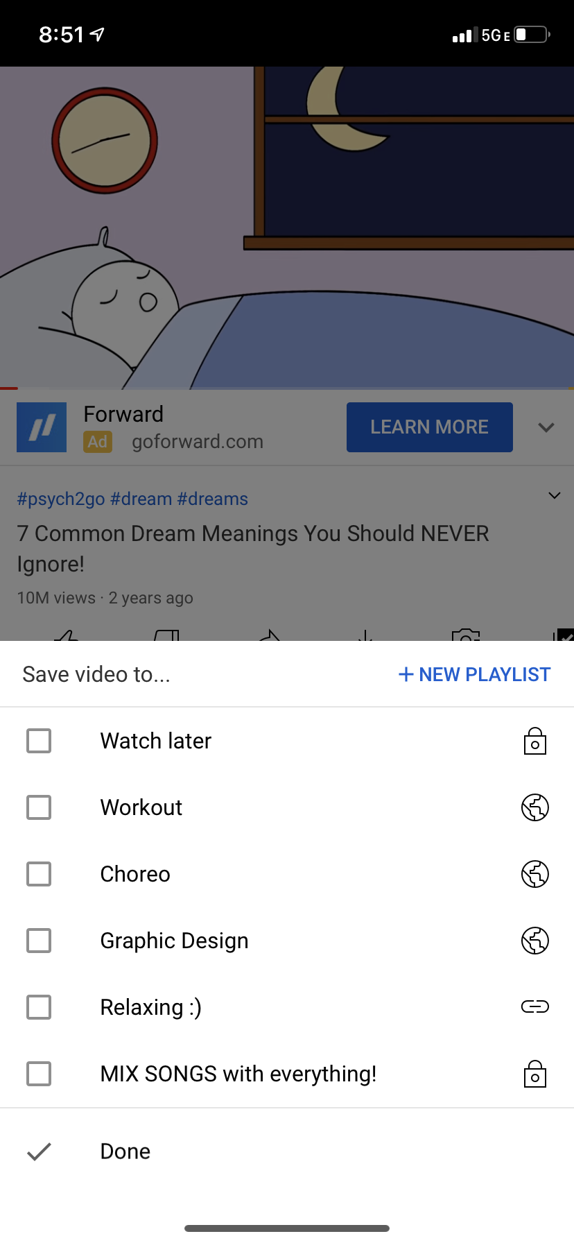
Youtube makes it easy to add videos to an existing playlist. I like how Youtube automatically creates the “Watch later” playlist since it is a typical playlist user will make.
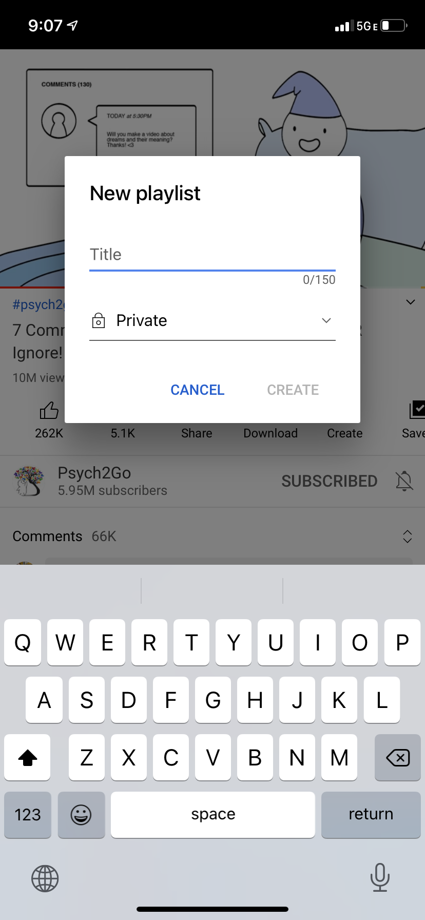
I like how simple the new playlist box looks and how it stands out in front of the dark opacity background.
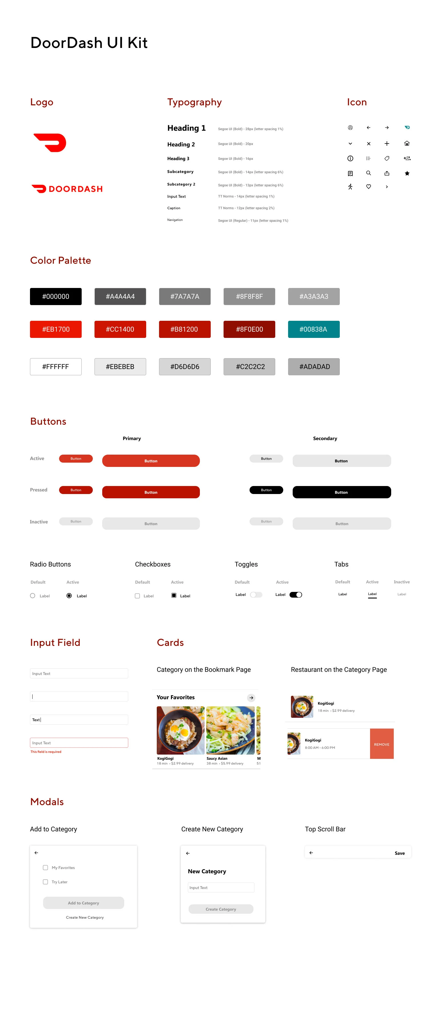
UI Kit
After gathering some layout inspiration from my mood board, I created my own modal and card designs. Other parts of the UI Kit are essential to replicate components from the DoorDash app. I can reference these components throughout my project to make sure elements align with the branding and app.
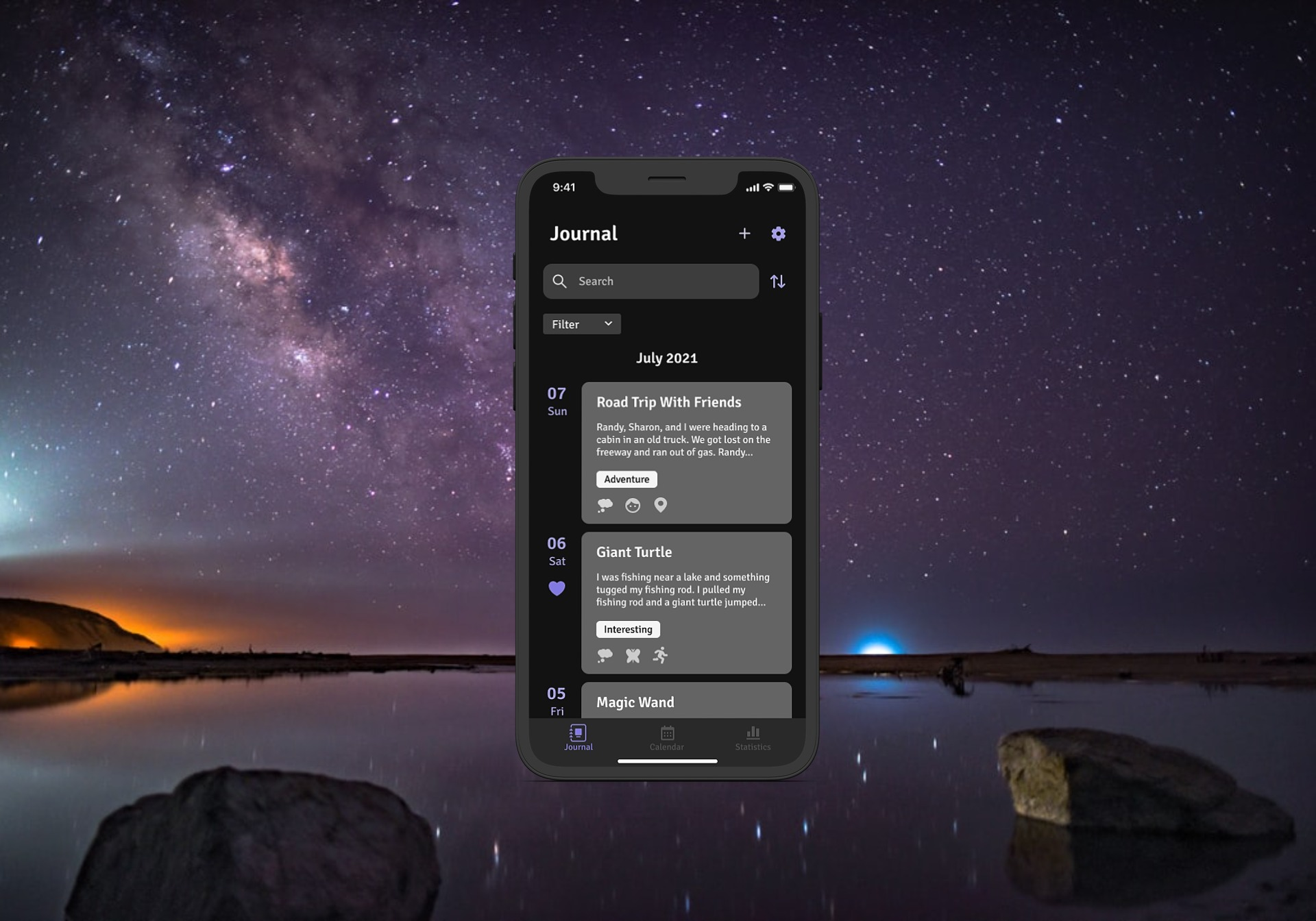
High-Fidelity Wireframes
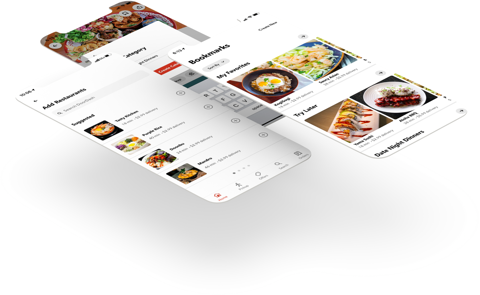
After defining the information architecture and UI components, I created high-fidelity wireframes to represent the end product visually. I divided the high fidelity into separate tasks to describe different scenarios that I will use for my prototype. Below are the high-fidelity wireframes. Please feel free to zoom in and take a look at them!

Prototype
Initial Mobile Prototype
After completing my Empathize, Define, and Ideate phases, I started on my prototype! I divided the prototype into the same tasks as I did with my high-fidelity wireframes. Luckily, that meant I could make copies of similar pages and wired each state to the corresponding pages. I conducted my usability testing with this prototype to see any room for improvements and observe the site’s functionalities. This prototype consists of four tasks to test the usability of the bookmark category-creating, sharing, and following features.


Test
Usability Testing, Affinity Map, Iterated Prototype
Usability Testing
Goals and Objectives
Identify issues participants come across while completing the tasks.
Understand the participant’s thought processes while completing the tasks.
Determine if participants can easily spot the appropriate buttons to complete the tasks.
Methodologies
Remote Observation: Participants will share their screen on Zoom while I observe their actions throughout the test.
Participants
Ages 21-35 years old
Users who are familiar with DoorDash
Scenarios
I gave participants 4 scenarios and tasks that tackle the efficiency and usability of the bookmark feature.
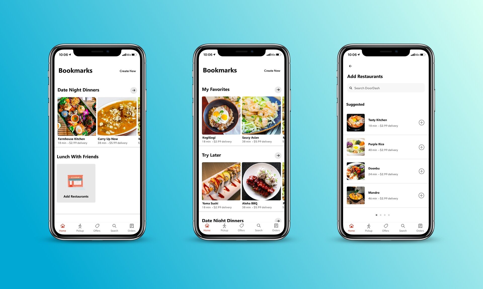
Task #1: Task: Bookmark Farmhouse Kitchen and then create a new category called “Date Night Dinners.”
Task #2: Share your “Date Night Dinners” list with your Chris.
Task #3: Follow the “Date Night Dinners” list.
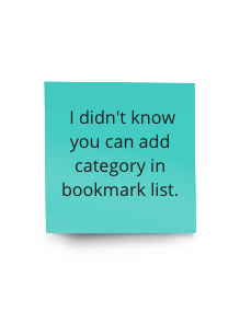
Task#4: Create a new bookmark category called “Lunch With Friends.” Afterward, add “Purple Rice” restaurant into that category.
You can check out these scenarios by viewing the detailed usability testing plan here.
Test Results
Scenario #1
4/4 users tapped on “Thai” cuisine on the homepage
3/4 tapped on the bookmark icon on the restaurant list
1/4 tapped on the bookmark icon on the restaurant’s page
Scenario #2
4/4 users were able to quickly find bookmarks icon on the homepage
4/4 users successfully sent the message to Chris
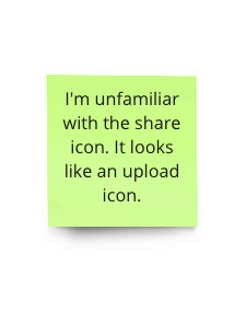
1/4 users were unfamiliar with the share icon since he did not use an iPhone
Scenario #3
4/4 users easily followed the list
Scenario #4
3/4 users immediately tapped on the bookmark icon on the homepage
1/4 of users tapped on cuisines first because he thought the only way to create a bookmark was through the restaurant page.
4/4 users easily created a new bookmark category
4/4 users found it easy to add “Purple Rice” restaurant into their created category
Test Findings
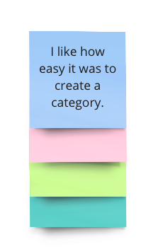
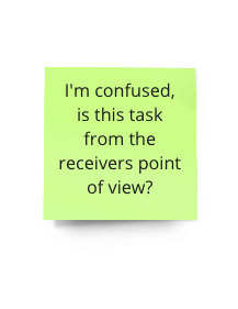
There were a few confusing parts during the test. One participant was an Android user, so he was unfamiliar with the share icon. He thought the icon looked like an upload icon. Another participant did not realize that they could create bookmark categories by going to the bookmarks page. I believe this participant might’ve got confused from task #1, which required him to create a new category after bookmarking a restaurant. One participant mentioned possibly having a sorting option in bookmarks to help users find their lists easily. Finally, another participant said they did not expect the “Follow This List” button at the bottom of the list. She suggested having it at the top so users wouldn’t need to scroll through the list to follow it.
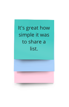
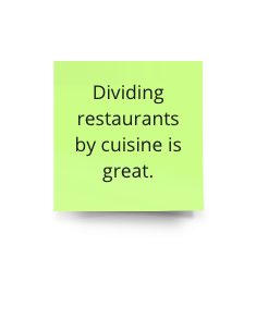
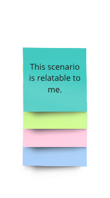
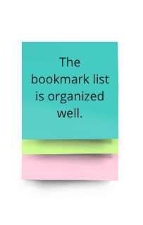
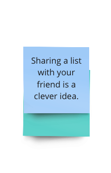
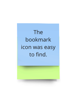
All participants agreed that this matched their expectations on how DoorDash would’ve rolled out this bookmark feature. They said it was organized well and fit the overall look of DoorDash. The buttons were easily accessible and guided them through the tasks. Some participants loved the unique parts of the feature, like the option of sharing bookmarks with friends. Participants wished this was a real feature because it was helpful, straightforward, and easy to use.
Affinity Map
I gained valuable insight into participants’ thought processes in navigating through the new bookmark feature from the usability testing. I received some positive feedback about the simplicity of creating a category and the overall idea of having this feature. Participants also provided excellent suggestions to consider that will become great opportunities for me to improve my prototype.

Opportunities
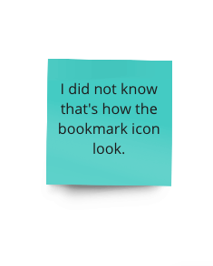
Compare the DoorDash share icon’s appearance in an Android phone.
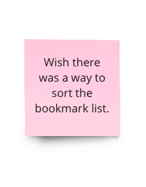
Add sorting options on the bookmark list.
Find a way for users to see “Follow This List” easily without needing to scroll down through the whole list.
Iterated Prototype
Below is the prototype based on the prioritized iterations. The prototype has four tasks, which corresponds to the tasks from the usability testing. Feel free to play around by scrolling and clicking the buttons on the prototype. After finishing each task, click outside the phone and find “Restart (R)” in the bottom right corner.

Conclusion
Reflection
Due to the pandemic, many people were required to shelter in place to protect themselves. Restaurants depended on food delivery services and takeout to continue their business. I wanted to work on an app that helped people and businesses through these current circumstances. That’s when I thought about DoorDash, which is a food delivery service app that I used all the time to support local restaurants. I also wanted to work with an app that I was already familiar with to develop features I wished the app had.
I came up with a bookmark feature because my friends and I take forever to decide where to eat. We would keep mental notes on restaurants we want to try but usually forget about them later. During the user interview, participants said they had problems remembering restaurants, finding restaurant suggestions, and finding an accurate “Favorites” list in DoorDash. From that information, I came up with a few How Might We statements to focus on the problems I am trying to solve.
I conducted an information architecture usability test to ensure that the location of the bookmark feature was easily accessible. Afterward, I gather photos of app pages to gain inspiration on setting up parts of the feature. Once I created my prototype, I received some suggestions such as button rearrangement and additional sorting options.
Adding a feature to an existing app was a new experience from my previous projects. Unlike the earlier projects, there was little room for creativity. The other challenge with this project was making sure I match the expectations of how DoorDash would have rolled out my feature. This project helped prepare me for future projects with similar objectives and limitations.
Other Case Studies
Dream Portal
End-to-End Mobile App
1011 Sip Tea
Responsive Website Design