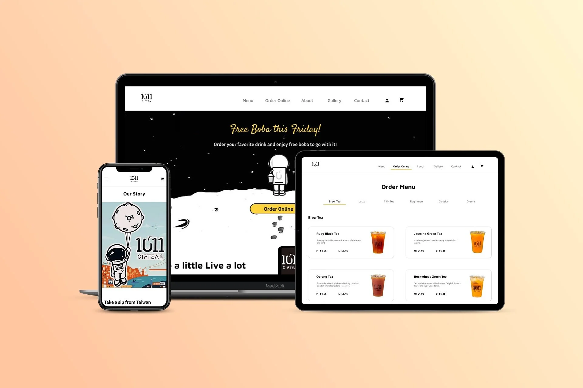
1011 Sip Tea - Responsive Design
Year: 2021
Duration: 4 weeks
Project: Solo Project
Role: Research, UX/UI Designer
Tools: Figma, Miro, Zoom

What is 1011 Sip Tea?
Founded in Taiwan, 1011 Sip Tea is a tea bar located in San Francisco, CA. 1011 Sip Tea brings together a modern lifestyle, healthy living, and tea culture. “SIP a little LIVE a lot!” is their slogan. Their mission is for customers to enjoy a cup of boba or bubble tea no matter how tight their schedule is.
Challenge
Increase sales and noticeability.
San Francisco has one of the most boba shops in California, making the boba industry very competitive. As a result, 1011 Sip Tea has trouble finding customers. Currently, this shop does not have a website, making it difficult for 1011 Sip Tea to expose themselves online.
I want to create a website design that showcases the shop’s fresh and unique branding. In addition, create an online ordering feature on the site to increase sales.
Design Goals
Design a responsive website for desktop, tablet, and mobile.
Create a new menu page that contains photos.
Improve the checkout process.
Create a website that aligns with the brand’s trendy aesthetics.
Design Process
Empathize
Engage with the people I’m designing for in order to understand their experiences and needs.
Define
Analyze my observations and define the core problems.
Ideate
Identify alternative ways of viewing the problem and look for new solutions.
Prototype
Produce versions of the product to investigate the solutions.
Test
Test the product using the solutions during the prototyping phase.

Empathize
Competitive Analysis, Remote Observations, Persona
Research Overview
Research Goals
Determine any difficulties users may encounter when purchasing boba online.
Discover features that customers find helpful.
Learn users’ thought process when buying boba online.
Methodologies
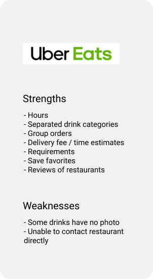
Competitive Analysis
Compare design features with other competitors. I can discover the methods competitors use to drive their sales. It can also help me identify any trends to make sure I am meeting and exceeding standards.
Remote Observation
Observe users’ actions through video on Zoom. Ask users to speak their minds while performing a task. Afterward, I will ask users questions related to my observations. I can learn the user's thought process and see if the user comes across any difficulties.

Competitive Analysis
Direct Competitors
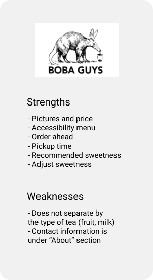
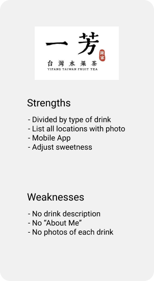
Indirect Competitors
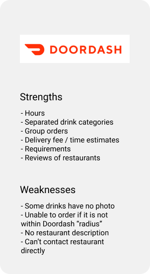
Findings
Good websites should give users control of their orders and have helpful features such as images and drink descriptions.I divided the findings into similar categories. Here are some conclusions and possible ideas from this secondary research:
Ability to contact the restaurant about inquiries is important.
Customers should be able to find contact information easily.
Hours and locations listed.
Drink descriptions and photos are important so customers know what they are buying.
The ability to adjust sweetness gives users more control of their drinks.
Separated categories make it easier for customers to browse for drinks.
Delivery fee and delivery time must be available.
Customers should have control of payment options and pickup options.
Quicker transactions when customers know what product options are required.
Remote Observations
Participants
Between the ages of 18-35 years old.
Orders boba more than 3 times per month.
Some participants from the Bay Area.
Familiar with ordering food online or on an app.
Remote Observation Findings
You can view the Research Guide.
Some websites have appealing hero images, but some are too distracting
The ability to make edits to orders is vital (scheduling a pickup time).
The menu should have photos, descriptions and be categorized.
All users had no problem adding drinks to the cart because the drink options indicated requirements.
Users enjoyed reading about the shop (about us).
The text should be legible, and the colors should match the brand’s theme.
Quotes or reviews are a great addition.
Certain links lead users to a different page than expected.
The menu has no images or disorganized.
Distracting colors that make text illegible.
No flexibility in pickup schedule.
Users are required to make an account to complete the pickup order.
Labels on links should be clear so users won’t be off guard.
Divide the menu into drink categories and have an image for each drink.
Give users the ability to make edits on their order.
Ensure colors are pleasant to the eyes while maintaining the brand’s theme.

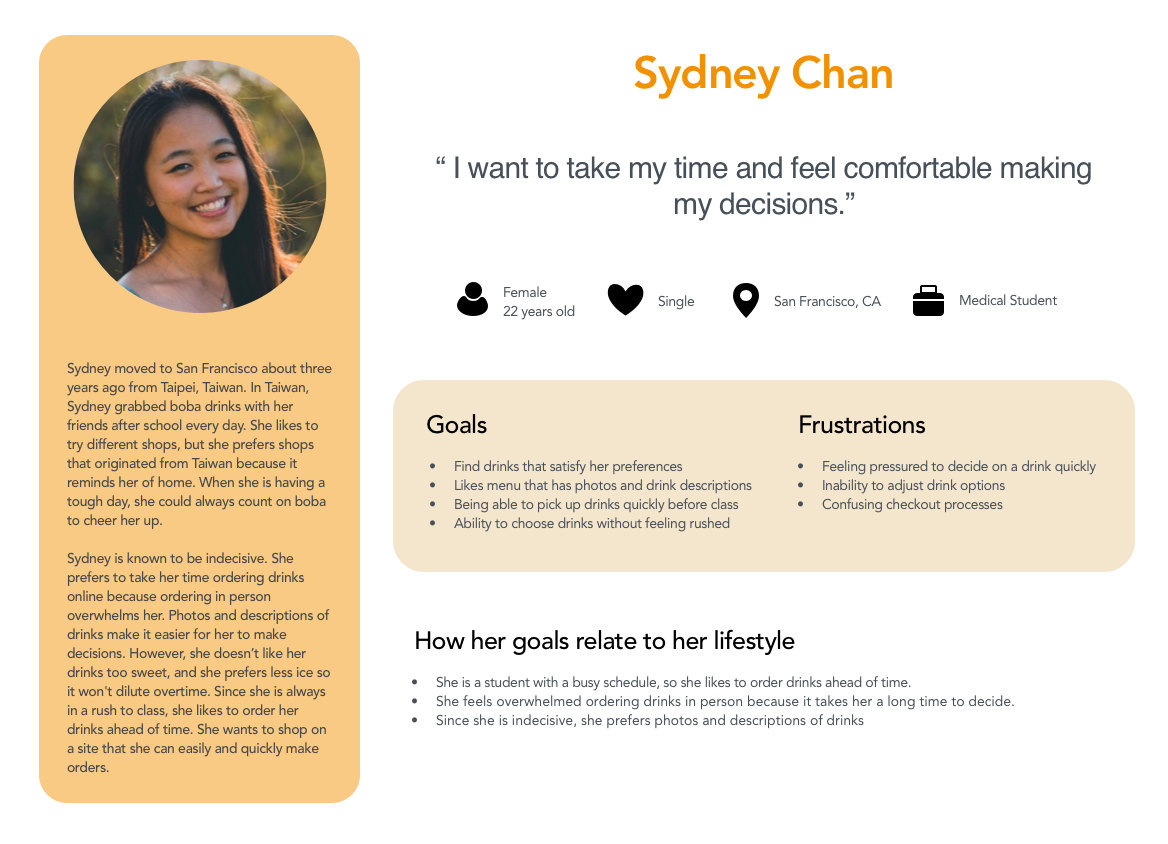
Persona
After gathering information from my research, I learned that customers order pickups online for convenience. They like the ability to order drinks ahead of time and the flexibility of scheduling the pickup time. Photos, categories, and descriptions of drinks help customers decide on their drink selection. Ordering online is also great for customers who enjoy taking their time choosing their drinks. I created a user persona Sydney who embodies the needs, frustrations, and goals.

Define
Information Architecture, Sitemap, and Flows
Information Architecture
Feature Roadmap
I created a list of features based on user research and prioritized them based on their importance. I organized the priorities by P1 (must have) - P4 (can come later). For example, the menu is needed for users to view the shop’s drinks. On the flip side, signing up for email notifications is not required to complete a purchase.

Sitemap
I created a sitemap to help me understand how I can structure the website. Ordering ahead has the most pages since the other categories in navigation bar just showcases the shop’s menu and branding.
Flows
Task Flow
I used a task flow to follow the user’s steps in completing the main task. The main task for this flow was purchasing Jasmine Milk Tea. Afterward, I can choose the key screens that will be part of the site.

Ideate
UI Design, Wireframes, Responsive Design
UI Design
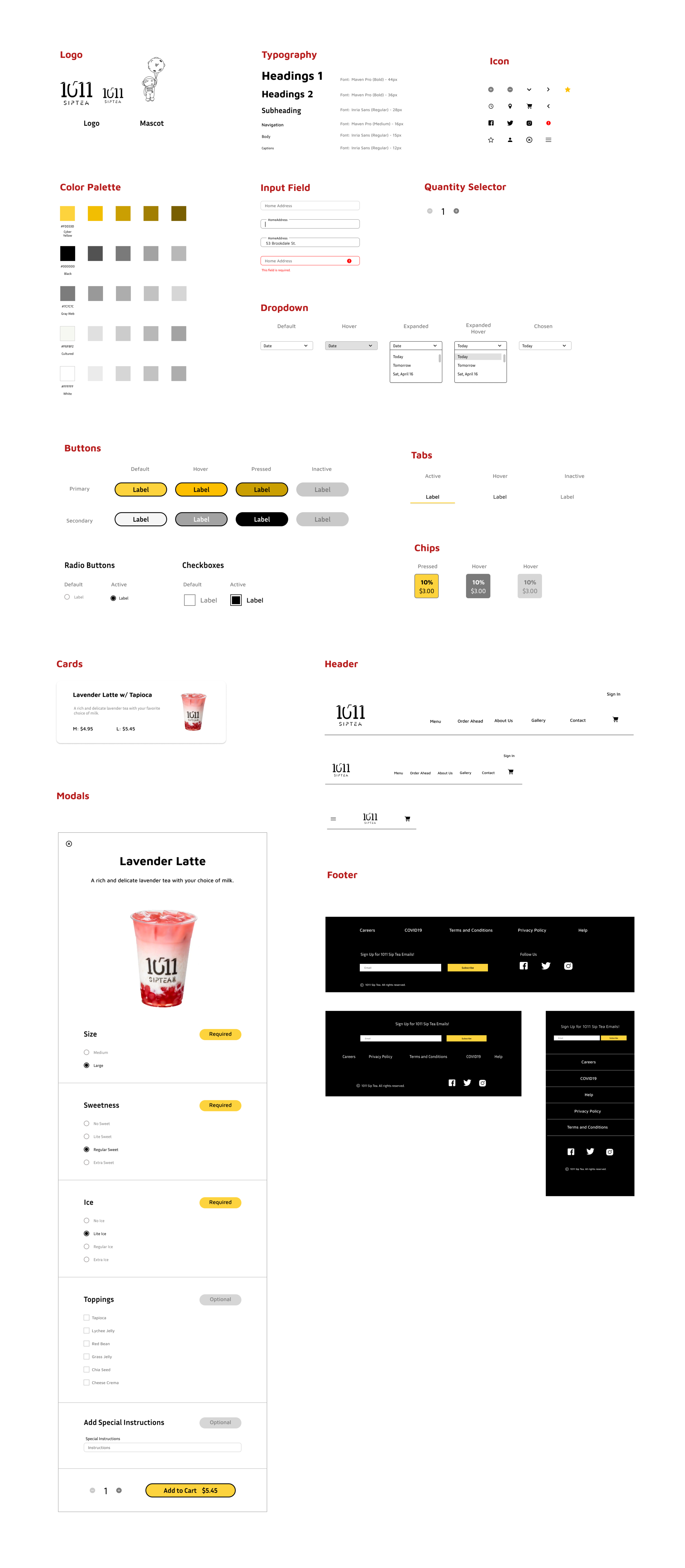
UI Kit
Their branding adjectives are tasty, casual, modern, and futuristic. I decided to start my Ideate stage with a UI Kit to create components that I can use moving forward. I want to maintain consistency throughout the website and that all UI elements are cohesive and aligned with 1011 Sip Tea’s brand. The color palette relates to the shop’s astronaut mascot and futuristic tone. I chose Maven Pro (sans-serif typeface) because of its unique curvature, flowing rhythm, and modern design.

Low Fidelity Wireframes
I created the pages based on the research and brand design. In the Empathize phase, I learned that users appreciate drink photos and descriptions because it helps them decide what to purchase. With that in mind, I created a menu page that contained those features. Users also enjoyed reading reviews and quotes from customers, so I included that on the homepage. Lastly, users stressed the importance of flexibility, especially in scheduling pickup time. Thus, I created a checkout page that enables those abilities.
Below are a few of the low-fidelity wireframes for the desktop. Feel free to click or tap on the button to view my wireframes in detail.
High Fidelity Wireframes
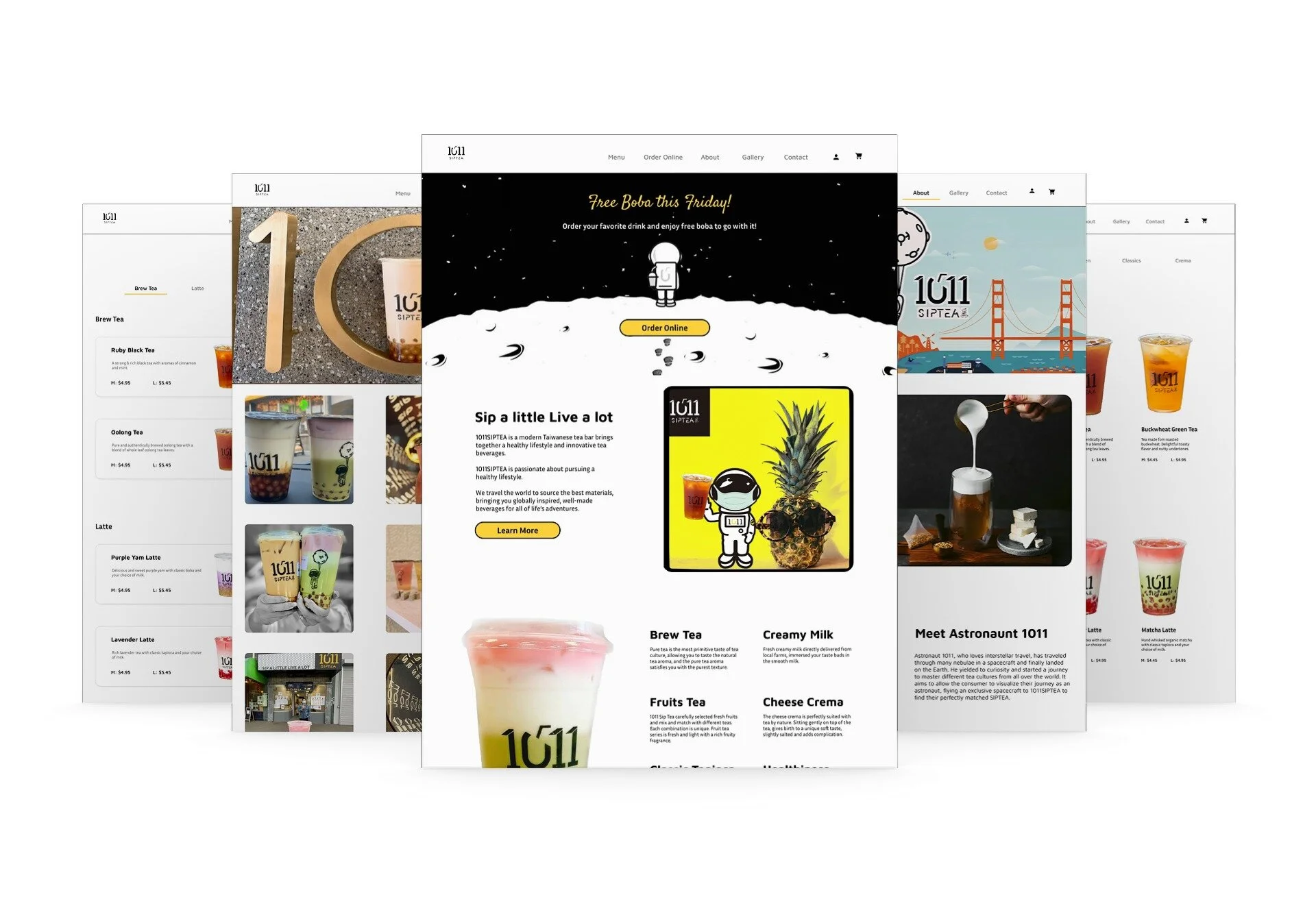
After defining the information architecture and UI components, I filled in the graphic details missing in my low fidelity wireframes to visually represent the end product. I would then build a prototype to validate complex interactions during usability testing to determine if the design aligned with users’ mental models and solved the problem identified in the Define phase.
Click or tap on the button below to view the rest of the wireframes on mobile and tablet.

Prototype
Initial Desktop Prototype
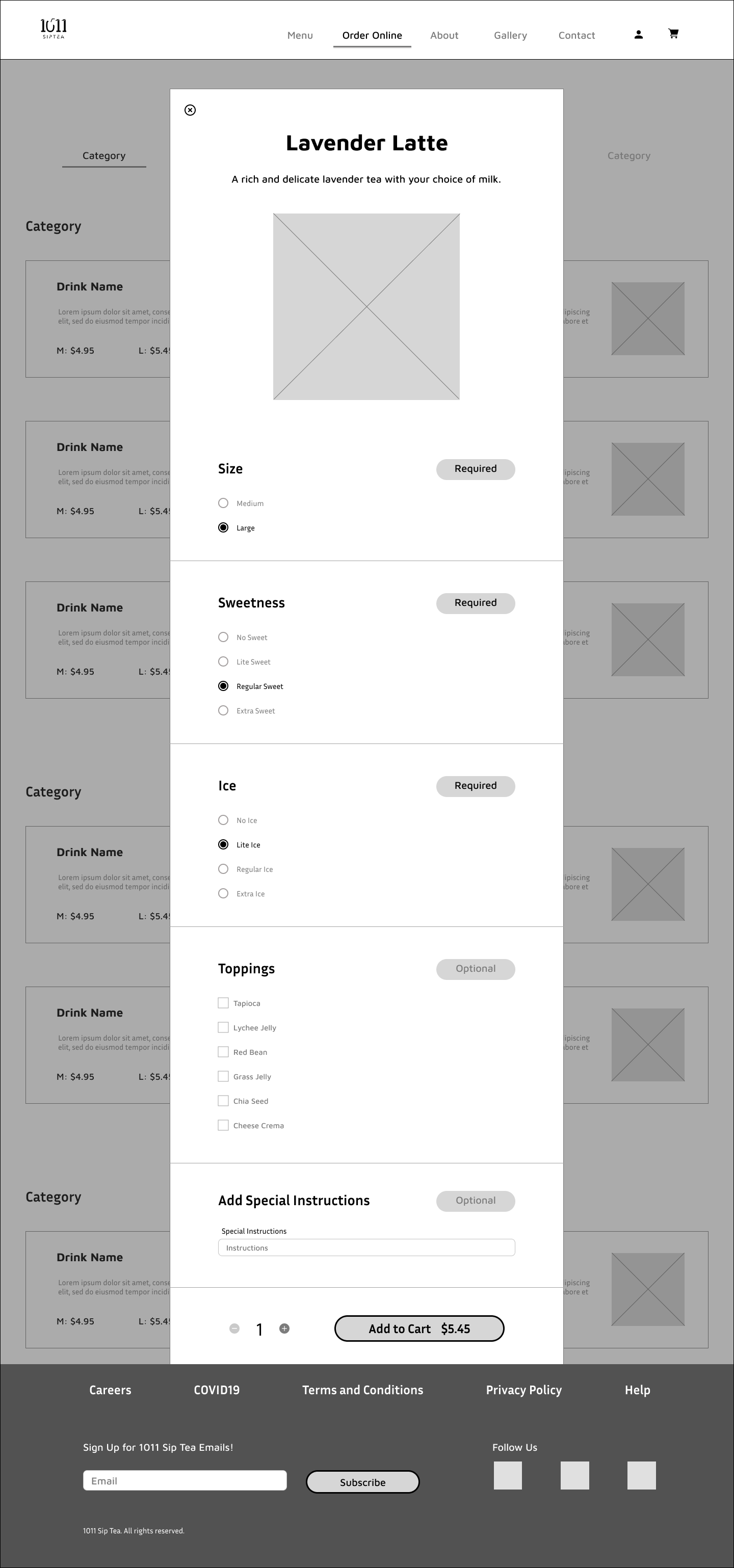
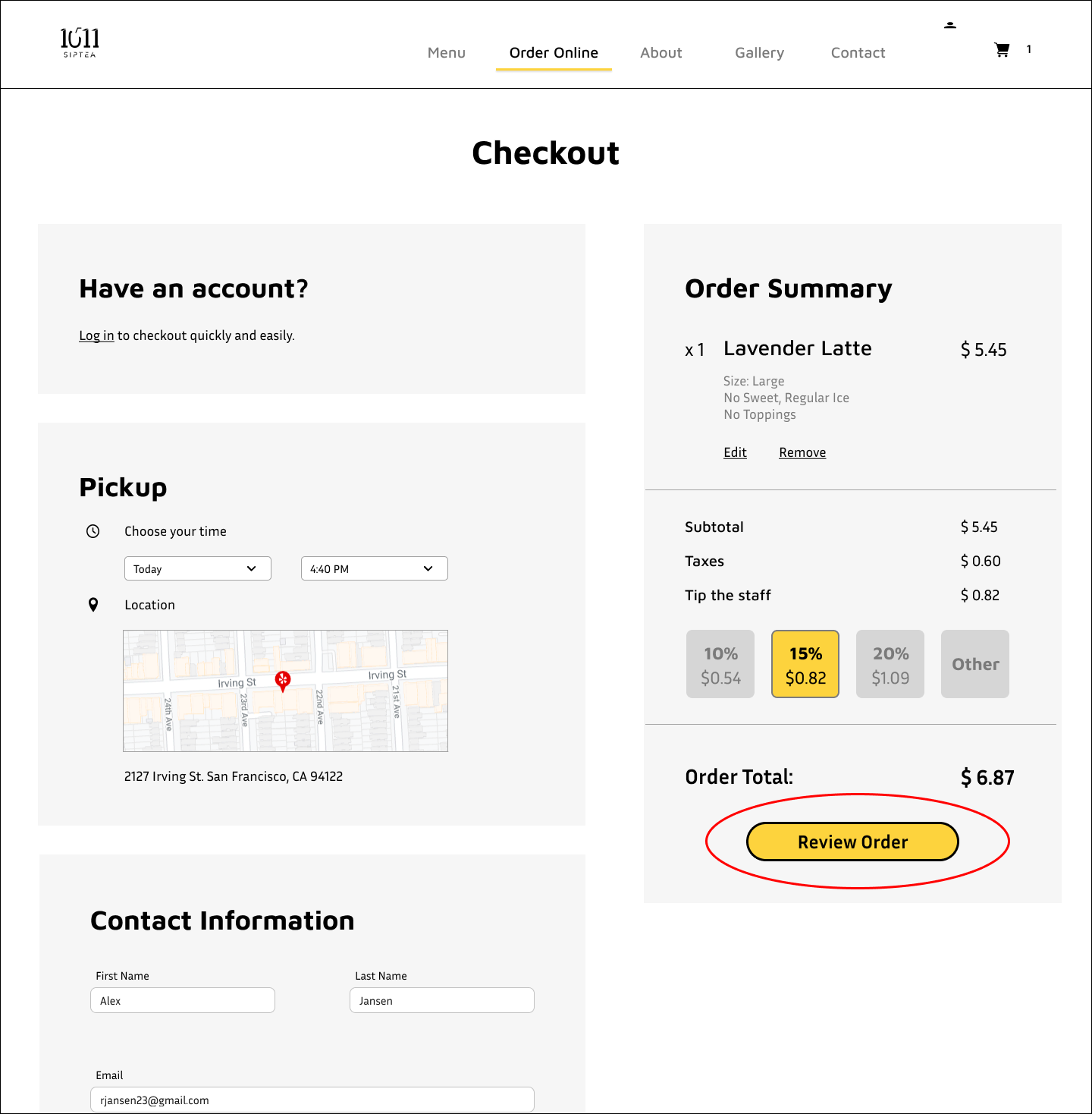
With information architecture, UI elements, and wireframes complete, I am ready for my prototype! I made copies of similar pages, incorporated the interactive states into each page, and wired each state to the corresponding page. With the prototype, I can conduct a usability test and observe the site’s functionalities. This prototype aims to order a Lavender Latte ( large, no sweet, regular ice, no toppings) for pickup at 4:40 pm. The menu has drink categories so users can filter the drinks, providing users another way to browse.

Test
Usability Testing, Affinity Map, Iterated Prototype
Usability Testing
Goals and Objectives
Understand the user’s thought processes and what actions they take when purchasing a drink online.
Discover any issues and struggles users experience.
Test the effectiveness of CTA in guiding the user to complete the task.
Determine if users use filters while browsing for drinks.
Methodologies
Remote Observation - Participants will share their computer screen while I observe their actions through Zoom.
Participants
3-5 participants
18-35 years old
Lives in the Bay Area
Enjoys drinking boba
Scenario
It is a hot day and you want to get a boba drink before work. You decided to order pickup from 1011 Sip Tea because it is close to work. You looked at their menu and you are intrigued by their Lavender Latte.
Task
Order a large Lavender Latte with no sugar, regular ice, and no toppings. Pick up today at 4:40pm.
Test Results
2/4 participants clicked “Order Online” on the navigation bar.
2/4 participants clicked “Order Online” on the hero image.
3/4 participants clicked on the “Latte” category in the menu.
1/4 participants immediately scrolled through the list of drinks.
2/4 participants used the menu’s photos to find the drink.
2/4 participants wanted to give more than 10% tip to the staff.
4/4 participants easily scheduled the pickup time.
4/4 participants reviewed their orders.
4/4 participants clicked “Place Order” and completed the order.
4/4 of participants said the CTA buttons helped guide them through the checkout.
2/4 participants added special instructions.
4/4 participants successfully added the drink into their cart.
Findings
After providing the task to the participants, they immediately clicked on "Order Online." Half of the participants clicked the "Order Online" button on the hero image, while others used the navigation bar.
Most participants clicked on the "Latte" category on the order menu page so that latte drinks appeared first. Participants thought that dividing drinks into categories could increase efficiency. Some participants browsed for the drink by viewing the menu's photos. However, the drink's red color threw off those participants. They assumed the Lavender Latte's color to be lavender or purple.
Half of the participants added special instructions to their drinks. They all agreed that "required" and "optional" indications on the drink options were helpful. All participants could add the drink to the cart, schedule their pickup time, review their order, and complete their order. Every participant said that the CTA buttons helped guide them throughout the checkout process.

Affinity Map
It was clear that the feedback from the empathize phase was successful in the usability testing. Participants complimented on the photos, filters, and scheduling flexibility. Participants provided great feedback and pointed out the information I missed on my website. With that in mind, I was able to come up with opportunities to improve my prototype.
Top Concerns for Users
Not knowing where the homepage reviews were from
Some buttons were placed in an odd location
Not knowing which drinks were popular
Unable to find a specific drink due to the drink’s color
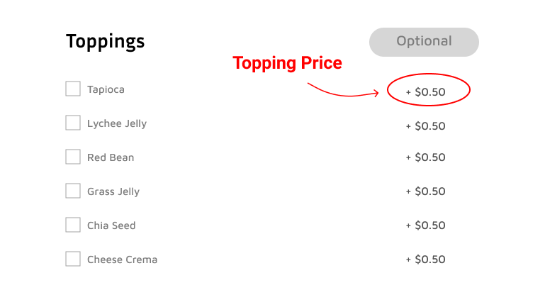
Missing topping prices
Opportunities
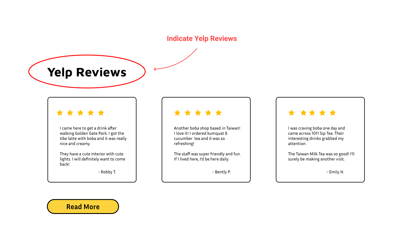
Specify that the reviews are from Yelp.
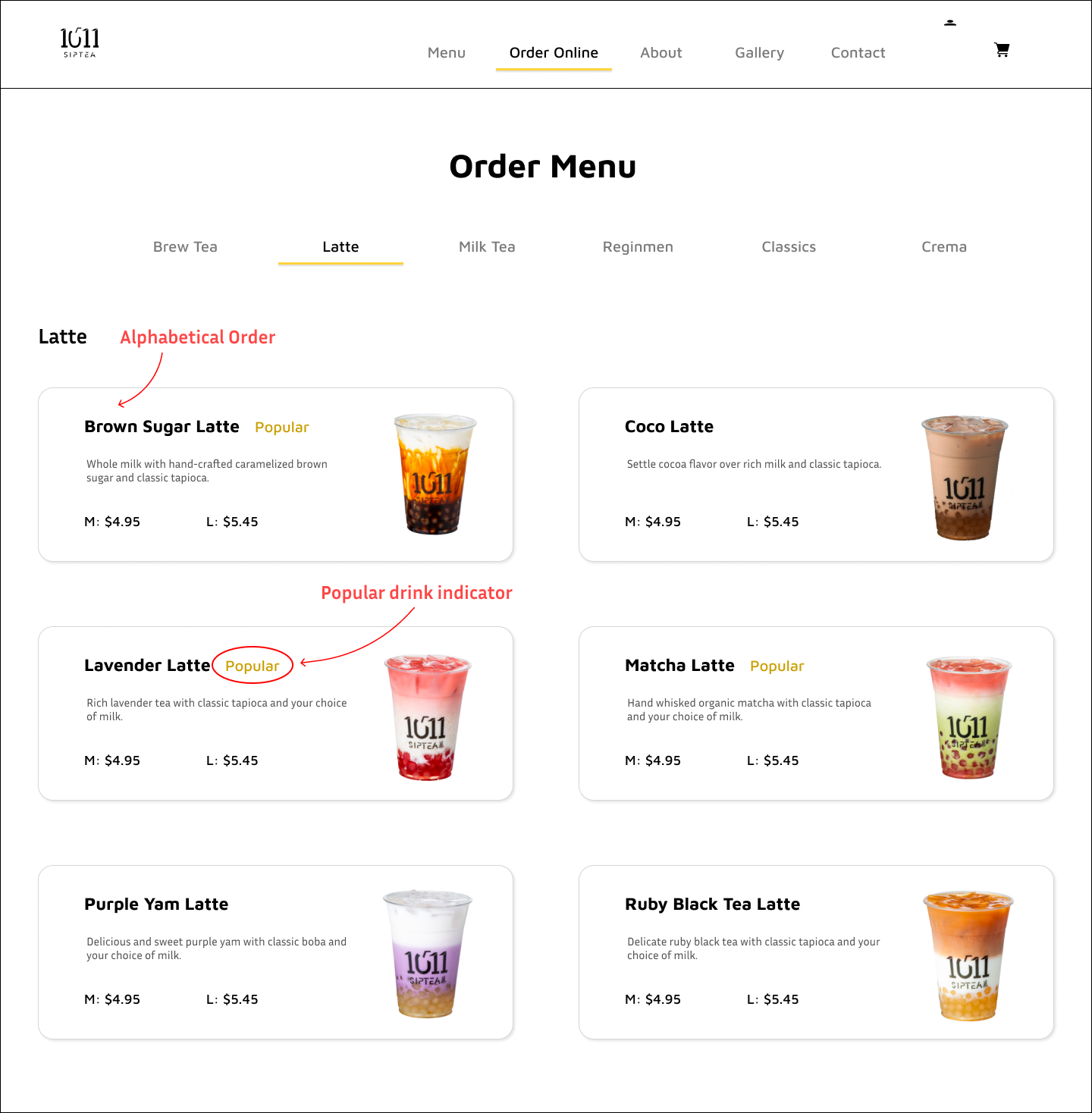
Indicate popular drinks on the menu.
Sort menu items by alphabetical order in case users have trouble finding the drink.
Add the pricing for each topping
Move the “Review Order” and “Place Order” buttons below the order total.
Iterated Prototype
Based on the opportunities I discovered from the Affinity Map, I made some iterations to the prototype.
I changed “Reviews” to “Yelp Reviews” to specify where the reviews are from.
As suggested, I added the price for each topping
Users were having trouble finding Lavender Latte because the drink color is red. I alphabetized the menu so that users can easily find a specific drink.
I also indicated popular drinks on the menu.
“Review Order” button was originally at the bottom of the page. Now it is on the order summary, which forces the user to review the order summary before moving on.
Below is the prototype based on the prioritized iterations. Feel free to play around by scrolling and clicking the buttons on the prototype.

Conclusion
I was excited to create a responsive website for 1011 Sip Tea, where I often purchase drinks. I thought designing a responsive site for a boba shop was a great idea since the boba industry is competitive in my area. I also admired 1011 Sip Tea’s uniqueness, variety, and trendy branding.
I examined different boba website layouts and the different sale platforms they used from my competitive analysis. At first, I thought to myself, “Can’t 1011 Sip Tea just use a sale platform like most boba sites?” However, working on an end-to-end design for this project meant I needed to make my checkout process. During the remote observation, participants stressed their concern about the lack of order flexibility (scheduling pick-up time) and the unnecessary steps needed to complete an order (requiring users to sign up). In addition, some participants noted the importance of having photos, drink descriptions, and an organized menu to help them decide on drinks. From my research findings and usability testing, I conducted a list of dos and don’ts that I can refer to when working on the prototype.
Even though working on this project took longer than I thought, I learned many skills to help me through future projects. I am excited to gain more UX/UI knowledge as I continue my design journey.
Other Case Studies
Dream Portal
End-to End Mobile App
DoorDash
Feature Within Existing Product